YouVersion · User-contributed screenshot · resized, content unchanged
A chapter grid that opens inside the book list
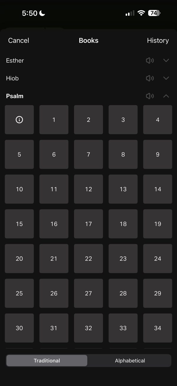
Psalm is expanded inside the same Books list. Its chapters appear as a grid of square tiles, starting with an information tile before chapter 1, while Esther and Hiob (Job) stay visible above.
Design takeaway
This is the same accordion structure observed in Mere Bible: book context stays visible while choosing. An introduction tile gives a book overview without leaving the picker; make sure it is clearly not chapter 0.
What this example establishes
Psalm is expanded inside the same Books list. Its chapters appear as a grid of square tiles, starting with an information tile before chapter 1, while Esther and Hiob (Job) stay visible above.
Limits and further verification
A still image shows one interface state. Gestures, timing, accessibility, persistence and what happens next were not tested. App version not recorded.
Provenance
- Platform
- iOS app · device model not recorded
- Image origin
- User-contributed screenshot · resized, content unchanged
- Source or capture date
- Captured 18 September 2025 · from embedded image metadata
- Reviewed
- 6 October 2026
- Version
- Not recorded
Screenshot captured by Tobias Treppmann for his app-pattern research and supplied for this design reference. Resized for the web; content unchanged. Interface, imagery and Scripture text remain the property of their respective rights holders.
Compare the relevant patterns
Finding a passage
Let people browse when they do not know a reference and jump when they do.
Editorial design proposal89 · Reading and ScriptureBook and chapter pickers: list, grid or drill-down?
Choose the browsing shape independently from the search field.
Editorial design proposal