Numbers, headings and notes
How much should surround the text?
Almost nothing around the words of the Bible is part of them. Verse numbers, chapter breaks, section titles, red letters, footnotes, study notes and now teaching videos were added by printers, translators and editors over centuries. Each helps someone find, follow or understand, and each quietly teaches them how to read. Whoever adds to the page today joins a long line of printers and editors, and shares their responsibility.
- 7 working options
- 7 app examples
- 6 takeaways
- Editorial review, not user-tested
The spectrum
From the bare text to inline media
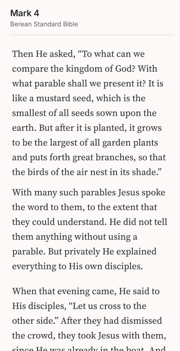 Familiar convention Reads as continuous writing Hard to find or citeTry it →
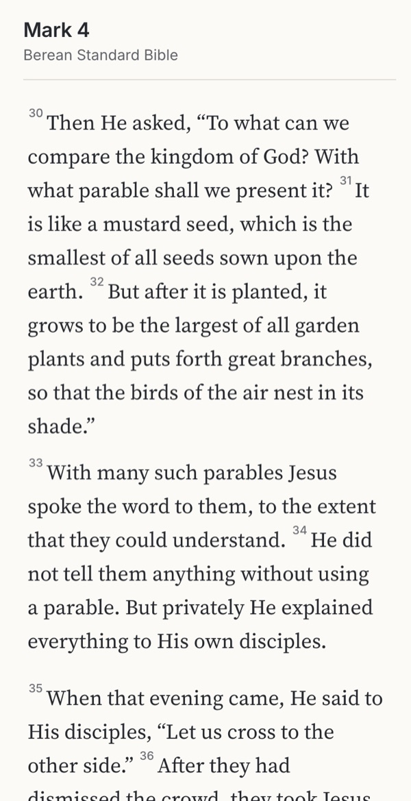 Familiar convention Easy to find and follow Small breaks everywhereTry it →
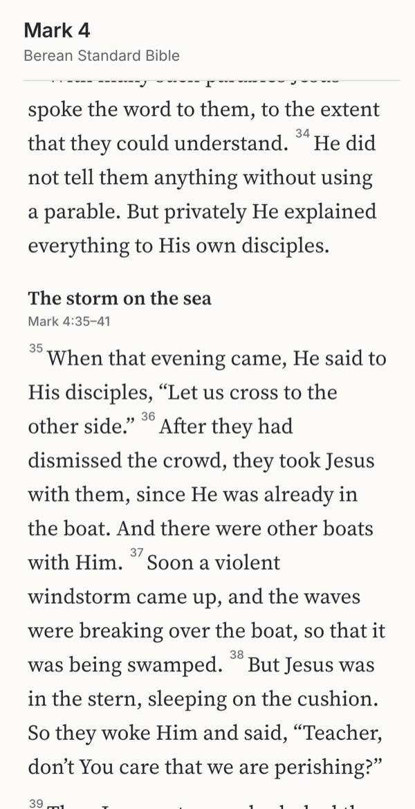 Observed Orientation at a glance Titles interpretTry it →
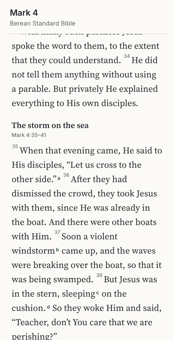 Observed Help one tap away Invites detoursTry it →
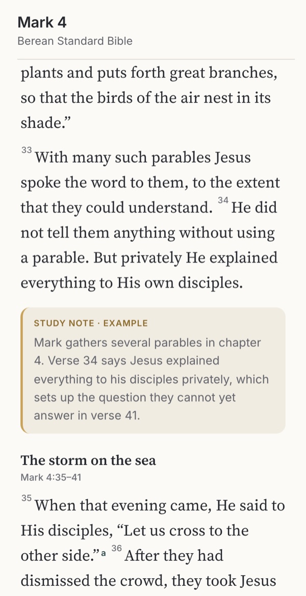 Familiar convention Context where questions arise Borrowed authorityTry it →
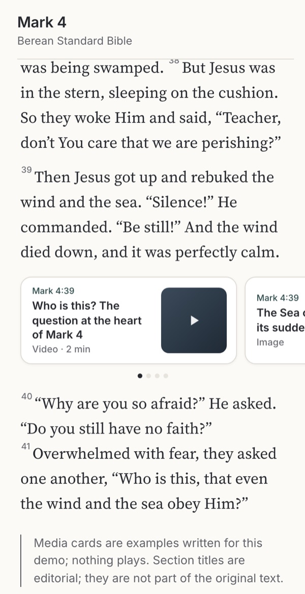 Observed Teaching at the verse Extras crowd the textTry it →
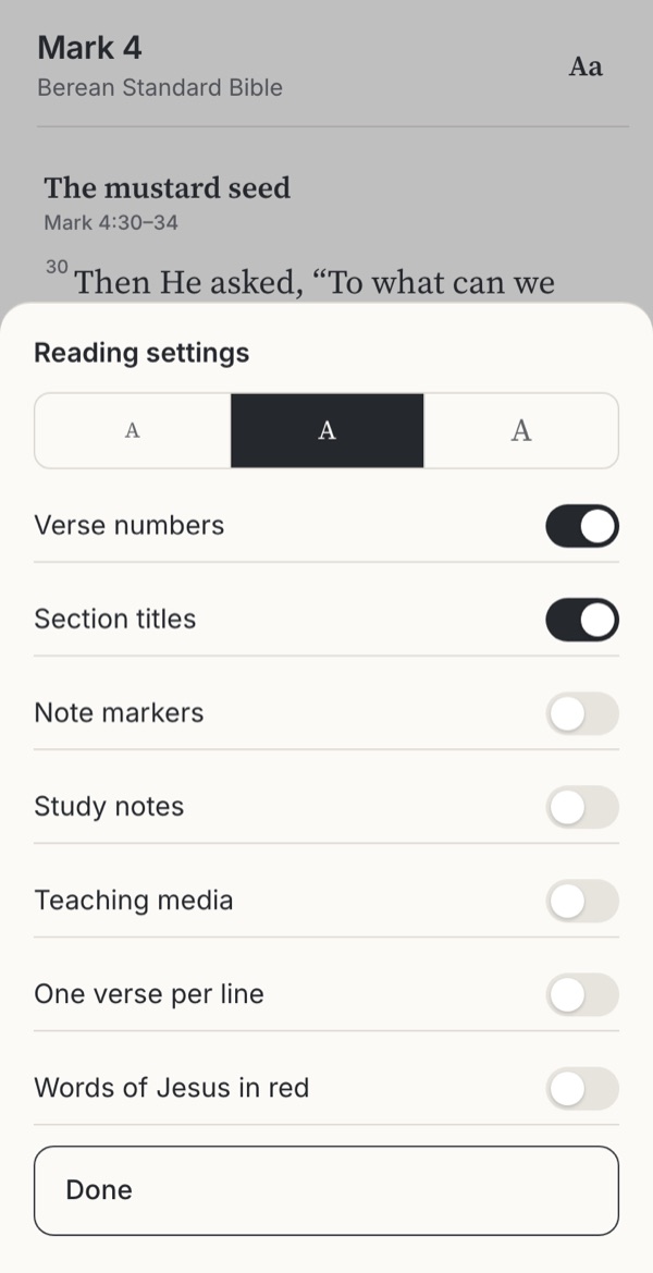 Observed Each reader sets it Defaults still decideTry it →
Stills from the working example below. Choose one to try it.
Try it
Try seven reading layouts
The same passage, Mark 4:30–41 in the Berean Standard Bible, with more or less around it. Read the storm on the sea in each option, open a note and come back, then try the reading settings in the last option.
Option
Why these settings?
Verse per line was the norm in printed Bibles for centuries and is still common in apps; paragraphs follow the sense of the text. Red letters were introduced in 1899 by Louis Klopsch. Both are editorial choices that sit alongside the six options, and in “Reader decides” they can also be changed in the drawer.
Familiar convention
1. Reader’s edition
Familiar from print reader’s editions such as the ESV Reader’s Bible and Biblica’s The Books of the Bible, which remove numbers, headings and notes.
Try this
Read from the mustard seed to the end of the storm. Then try to tell someone where “Be still!” is.
Makes easier
The text reads as continuous writing; nothing interrupts, and nothing suggests reading sentence by sentence.
Costs
Harder to find or cite a verse, or to follow a preacher who says “verse 39”.
Ask your teamIs reading through, or finding and citing, the main job here?
Familiar convention
2. Verse numbers
The default in almost every Bible app; verse numbers date from Estienne’s 1551 Greek New Testament.
Try this
Find verse 39. Then switch to one verse per line in the settings.
Makes easier
Easy to find, cite and follow along in church or a group.
Costs
Each number is a small break; text can start to read as a list of separate sayings.
Ask your teamHow light can the numbers be while still easy to find?
Observed
3. Section titles
Observed in YouVersion and Bible.is, where translation editors’ titles and verse ranges head each section (see the screenshots below). Titles here are our own.
Try this
Skim for the storm. Then read the title and ask whether it says anything the text does not.
Makes easier
Orientation at a glance, and better memory for how a chapter is organised.
Costs
Titles interpret. “The storm on the sea” or “Jesus calms the storm” steer attention differently, and can be mistaken for Scripture.
Ask your teamWho writes the titles, and does the styling make clear they are added?
Observed
4. Note markers
Observed as a “Note Indicators” switch in Mere Bible’s reading settings (see the screenshots below). Notes here are examples written for this demo.
Try this
Open note e on “Be still!”, read it, and go back. Are you on the same verse?
Makes easier
Translation choices and cross-references are one tap away, without leaving the passage.
Costs
Every marker invites a detour; more markers mean more decisions while reading.
Ask your teamWhich notes earn a marker in the main reading view?
Familiar convention
5. Study layout
Familiar from study Bibles in print and in apps, where notes sit alongside the text. Notes here are examples written for this demo.
Try this
Read the study note after the storm. Then ask what it told you to look for.
Makes easier
Context and background right where questions arise; useful for study and preparing to teach.
Costs
Notes speak with borrowed authority. The Scofield notes shaped how millions read prophecy for a century.
Ask your teamWhose interpretation do the notes carry, and does the reader know?
Observed
6. Inline media
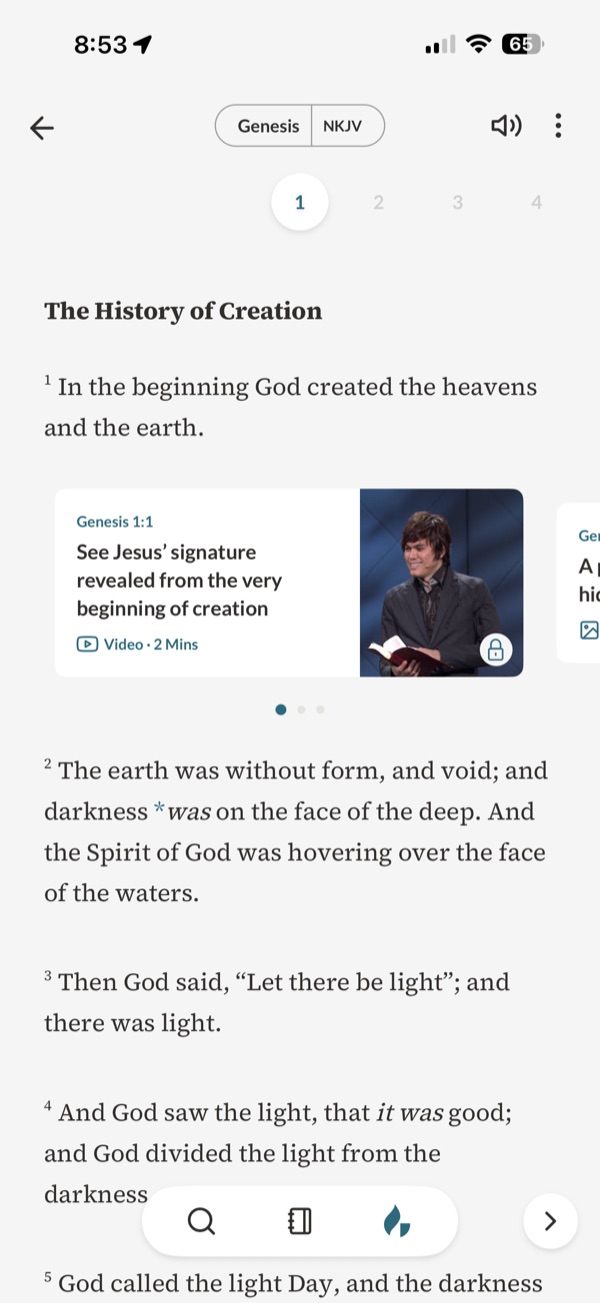
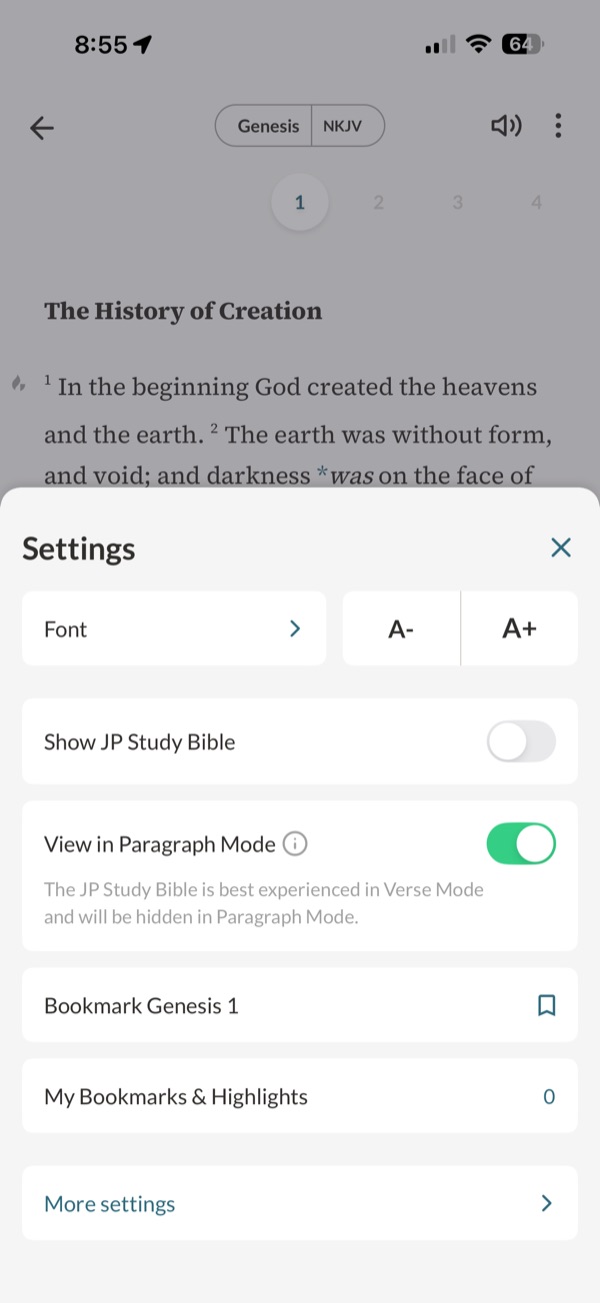
Observed in the Joseph Prince app’s study Bible: a swipeable row of video, image, audio and book-excerpt cards pinned to exact verses, some locked for subscribers (see the screenshots below). Cards here are examples written for this demo.
Try this
Read up to “Be still!”, swipe through the cards and open one. Then ask what you remember of the verse.
Makes easier
Teaching arrives exactly where the question arises, in the format someone prefers to learn in.
Costs
Interesting extras can crowd out the text: in learning research, vivid but non-essential media reduced recall and understanding. It also puts a ministry’s voice, and sometimes a paywall, inside Scripture.
Ask your teamWhose voice is pinned to the verse, and does it serve the reading or compete with it?
Observed
7. Reader decides
Observed in Mere Bible’s reading-settings drawer, with switches for red letters, verse numbers, note indicators and section headings.
Try this
Open Aa, switch on red letters and the larger text, then close it. Did your place stay put?
Makes easier
Each reader sets what they need, and can change it for a different kind of reading.
Costs
Most people never change defaults, so the default still decides what most people see.
Ask your teamWhat should the default be, and how will people find the switches?
What we noticed
Takeaways
Everything around the text is someone’s addition
Chapters date from the thirteenth century, verse numbers from 1551, red letters from 1899. Section titles and notes come from translators and editors. Genette calls this a threshold of interpretation: it shapes how the text is received before anyone reads a word.
Notes have always carried theology
The Geneva Bible’s marginal notes were partisan enough that the 1604 rules for the King James Version banned notes except for Hebrew and Greek words. Three centuries later, the Scofield notes carried dispensationalism to millions. A study layout is a voice beside the text, and readers should know whose.
Headings help structure, and steer meaning
Headings improve memory for how a text is organised, and titles bias comprehension towards what they name. “The storm on the sea” and “Jesus calms the storm” point a reader at different things. Style titles so they cannot be mistaken for Scripture, and say who wrote them.
Every marker is a decision
In hypertext research, links add decisions and visual processing that can impair reading, most for less experienced readers. Keep markers few and typed, open notes in a sheet over the passage, and return to the same verse.
Media inside the text is a voice and a cost
The Joseph Prince app pins video, image, audio and book-excerpt cards to exact verses, some locked for subscribers, and hides the layer in paragraph mode. Teaching at the verse can help, but learning research finds vivid, non-essential extras reduce recall and understanding. Say whose teaching it is, keep it switchable, and think hard before putting a paywall inside Scripture.
Defaults decide for most people
Mere Bible lets readers switch numbers, headings, note markers and red letters. That serves people who look for it; most never change a default. Choose the default for your main reading, and make the switches easy to find.
Use cases
Which reading, which unit?
People read Scripture for different reasons, sometimes in the same week. Each reason fits some points on the spectrum better than others.
| Reading | Needs | 1 Reader’s edition | 2 Verse numbers | 3 Section titles | 4 Note markers | 5 Study layout | 6 Inline media | 7 Reader decides |
|---|---|---|---|---|---|---|---|---|
| Reading a book through | Nothing between sentences | Good fit | Possible | Possible | Poor fit | Poor fit | Poor fit | Possible |
| Following a sermon or group | Numbers to find the verse | Poor fit | Good fit | Good fit | Possible | Poor fit | Poor fit | Possible |
| A first read of a passage | Orientation without interruptions | Possible | Possible | Good fit | Poor fit | Poor fit | Poor fit | Possible |
| Careful study | Translation notes and cross-references | Poor fit | Possible | Possible | Good fit | Good fit | Possible | Possible |
| Preparing to teach | Context, background, other views | Poor fit | Poor fit | Possible | Good fit | Good fit | Good fit | Possible |
| Reading aloud in church | Clean text, clear sense breaks | Good fit | Possible | Possible | Poor fit | Poor fit | Poor fit | Possible |
| Readers with dyslexia or low vision | Size, spacing, fewer marks | Good fit | Possible | Possible | Poor fit | Poor fit | Poor fit | Good fit |
Editorial judgments drawing on the research below, not test results.
The research behind it
Theology, practice and science
History and tradition
How the apparatus arrived
Numbers and chapters are late arrivals
Stephen Langton’s chapters date from the thirteenth century; Robert Estienne numbered New Testament verses in 1551, and the Geneva Bible of 1560 was the first English Bible to use them.
Notes were contested from the start
The 1604 rules for the King James translators allowed no marginal notes except for Hebrew or Greek words, partly in reaction to the Geneva notes. The Scofield Reference Bible of 1909 shows the opposite: notes that taught a framework to millions.
Red letters and reader’s editions
Red letters began with Louis Klopsch in 1899. Reader’s editions, such as Biblica’s The Books of the Bible and the ESV Reader’s Bible, remove numbers, titles and notes so the books can be read whole, and churches have read them together.
Interpretation
Why apparatus is never neutral
A threshold, not a border
Genette describes titles and notes as a threshold that influences how a text is received. For Scripture, that means headings and notes are interpretation, however modest.
Context guards meaning
Reading a verse within its passage and genre is the first rule of interpretation in widely used evangelical guides. Numbers make it easy to lift a verse out; headings and paragraphs keep the passage visible.
Reading science
What helps and what costs
Headings help memory for structure
Signals such as headings improve memory for a text’s organisation, and titles bias comprehension towards their topic.
Extras can crowd out the essential
In a meta-analysis of learning studies, interesting but non-essential details, especially visual ones, reduced both recall and transfer.
The eLearning Coach, summarising Rey (2012) and Mayer’s coherence principle
Markers cost attention
Links and markers add decisions that can impair reading, especially for readers with less prior knowledge or working memory; clearly typed and restricted links help.
Accessible reading
Best practice
Size, spacing and emphasis
Aim for 16–19 px text, 1.5 line spacing and left alignment, and mark additions with weight or colour rather than italics.
Notes that return to the place
Open notes over the passage, move focus into the note and back to the marker when it closes, and keep markers large enough to tap without crowding the line.
Every source, with what it can and cannot show, is listed under Go further → Sources and their limits.
Where to start
Which fits your product?
IfPeople read whole books or long passages
Start withA reader’s edition, with numbers available on request
IfPeople follow sermons, groups or plans
Start withLight verse numbers and clearly styled section titles
IfPeople study or prepare to teach
Start withNote markers with typed notes; study notes clearly attributed
IfYour ministry’s teaching is the point of the app
Start withInline media that names its teacher, can be switched off and keeps the text first
IfYour audience is mixed
Start withA sensible default with a settings drawer that keeps the place
These are editorial judgments from design review, not results of user testing.
In real apps
Examples in use
Attributed screenshots with dates and review limits. A screenshot shows an implementation; it does not show that it works for every audience.
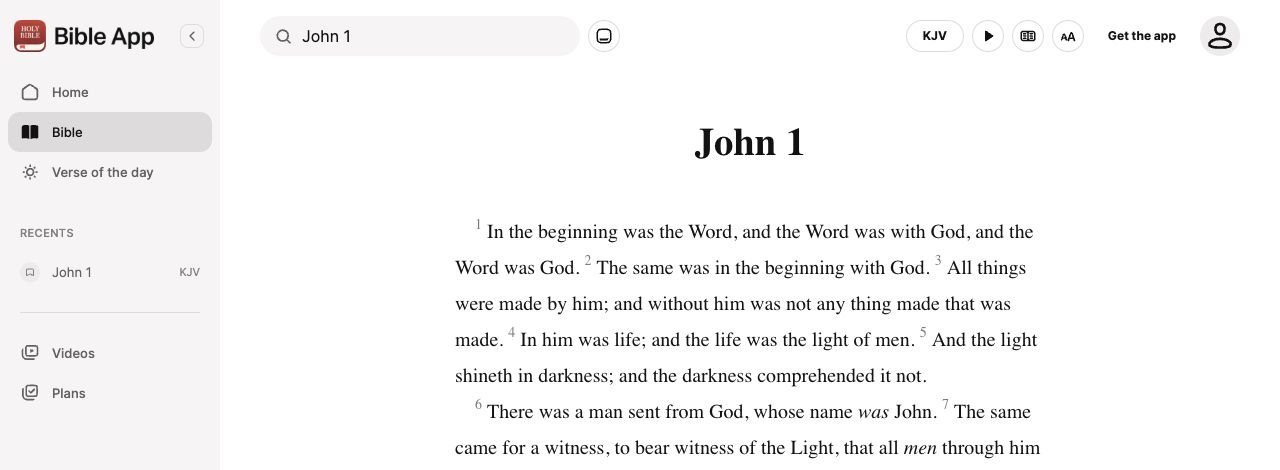 YouVersion · Desktop web
Continuous prose with reader controls
Direct web capture · cropped
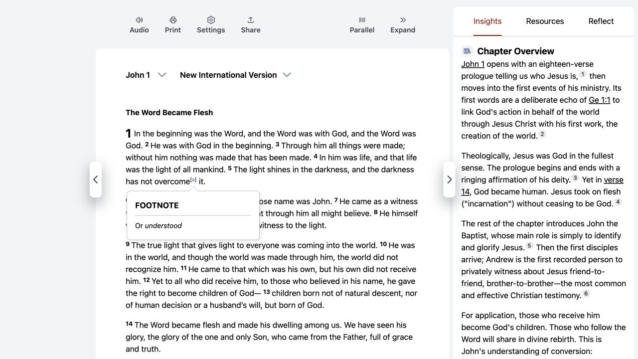 Bible Gateway · Desktop web
A footnote preview inside the passage
Direct web capture
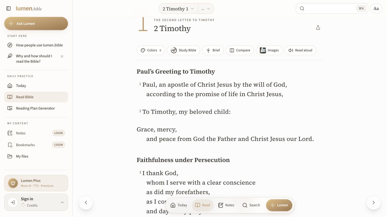 Lumen Bible · Desktop web · English interface
Phrase-grouped text inside a chapter reader
Direct signed-out web capture
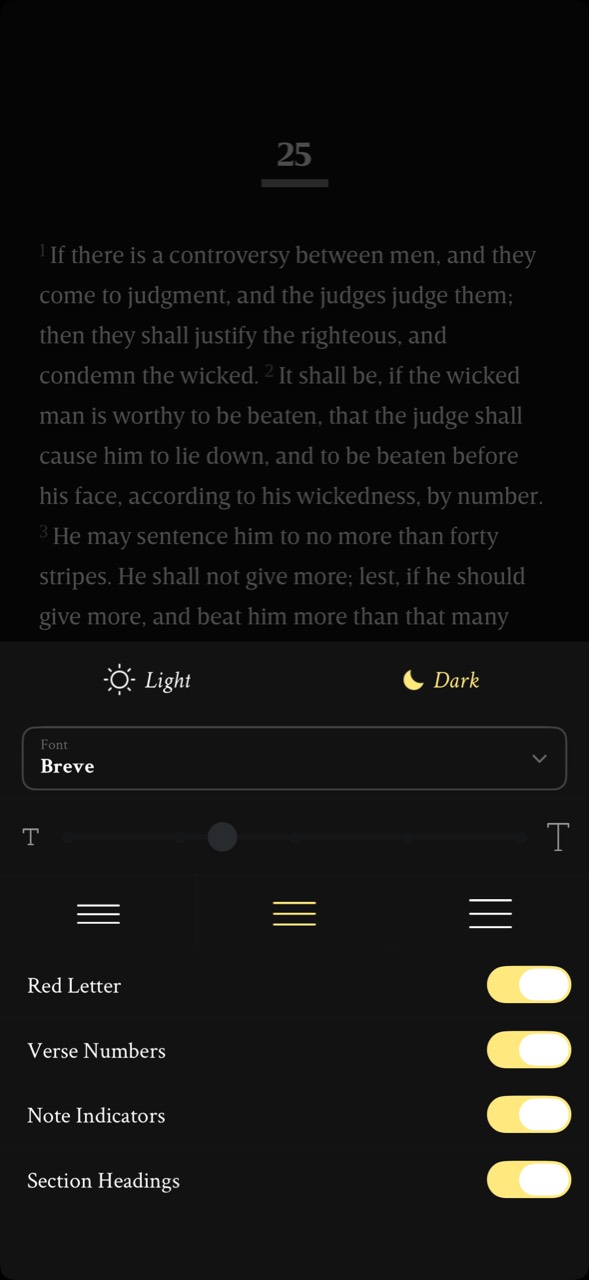 Mere Bible (formerly NeuBible) · Mobile interface · device and OS not independently verified
Reading settings in a bottom drawer
User-contributed screenshot · unedited
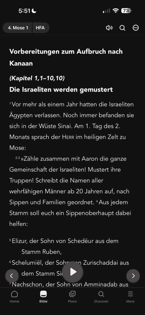 YouVersion · iOS app · device model not recorded
A chapter with section headings and verse ranges
User-contributed screenshot · resized, content unchanged
 Joseph Prince · iOS app · device model not recorded
Teaching cards pinned to a verse
User-contributed screenshot · resized, content unchanged
 Joseph Prince · iOS app · device model not recorded
A study layer you can switch off
User-contributed screenshot · resized, content unchanged
Theological reflection
What is this practice for?
What the page around Scripture is for
“Do not add to His words, lest He rebuke you and prove you a liar” (Proverbs 30:6). Chapter and verse numbers, headings and notes are all additions, made over centuries to help readers find and follow the text. They serve the words; they are not the words.
Where Christians differ
The King James translators banned interpretive notes; the Scofield Reference Bible carried a whole interpretive system in its notes; reader’s editions remove almost everything. Red letters for the words of Jesus are loved by some and questioned by others, since all Scripture is “God-breathed” (2 Timothy 3:16). No choice is neutral.
What follows for design
Make every addition look like an addition and name who added it. Default to the least apparatus your readers need, and let them add more. Never place promotion inside the text, where it borrows Scripture’s authority.
In conversation with
- Second Vatican Council, Dei Verbum (1965) asks for “suitable footnotes”: apparatus is welcomed, and judged by whether it suits the reader.
- Augustine, On Christian Doctrine I.36.40 gives the test for any note: does it build up love of God and neighbour?
Scripture is quoted from the Berean Standard Bible. This reflection is the editor’s, written from within the Christian tradition and open to correction. How we approach theology here →
Three ways to build
What would each way do here?
ExploitativeTakes from the person
Promotions and media placed inside the text, where they borrow its authority.
EthicalDoes no harm
Label every addition and name who wrote it.
RedemptiveGives something up for them
Default to the clean text even where study content would earn more.
The three ways are Praxis’s frame for redemptive entrepreneurship; their application here is ours. Why we use it, and its limits →
Take into your next review
What surrounds the text by default, who wrote it, and can a reader tell it apart and turn it off?
Exercise
Show three people your reading screen and ask them to point to everything that is not Scripture. Then open a note and close it, and switch a setting mid-chapter: does each person land on the same verse?
Everything you add is a voice beside God’s word; let readers always tell which is which.
Record the decision with the worksheet →
Something missing or wrong here? Send a correction or suggest a topic.
Details
Go further
This deep dive brings together 5 earlier patterns. Their guidance, wireframes and sources are kept below; their old addresses lead here.
Edge cases to design for
Choose a default by the main reading the product serves: a reader’s edition for reading through, numbers and titles for finding and following, notes and study material for study. Make every addition look like an addition: lighter type for numbers, a different style for titles, markers that open notes in a sheet and return to the same verse. Say who wrote headings and notes. Offer a settings drawer that changes the apparatus without moving the reader’s place, and keep poetry lineation and paragraphing from the edition.
What tends to go wrong
Headings styled like Scripture; study notes that read as the text’s own voice; note markers too small to tap or that jump away from the passage; settings that reflow and lose the reader’s place; red letters or headings that cannot be switched off; verse-per-line layouts that break poetry and paragraphs.
How to test it
Ask readers which parts of the screen are Scripture and which were added. Open a note and return: does the reader land on the same verse? Switch settings mid-chapter and check the place is kept. Compare retelling after reading the same passage as a reader’s edition and as a study layout.
Earlier pattern: Verse numbers that help without taking over
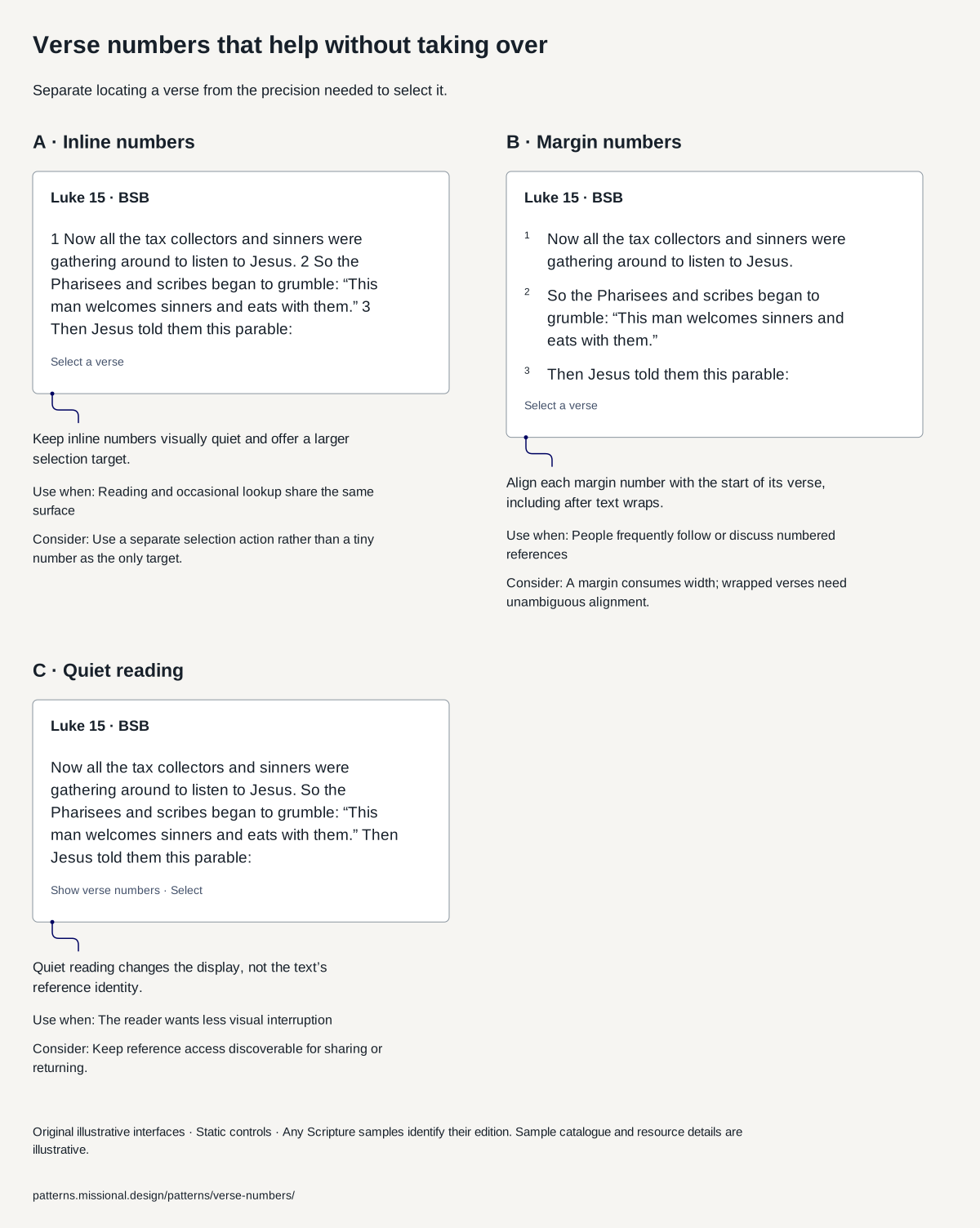
Separate locating a verse from the precision needed to select it.
Guidance
Use modest inline numbers for a general reading default. Compare margin numbers for reference-heavy tasks and an optional quiet view. Preserve an accessible way to reveal references and select a verse without tapping a tiny superscript.
What tends to go wrong
Colour-only selection; hiding numbers with no way to recover a reference; a long-press-only action; copying text without its edition and reference.
How to test it
Find and select a verse with enlarged text, keyboard and screen reader. Check that hiding visual numbers does not remove reference access.
Sources
- Understanding ReflowOfficial guidance reviewed on 5 October 2026 · Semantic scroll restoration is an original design proposal, not a requirement stated by this criterion.
- Scripture structure documentationRelevant structure and marker references reviewed · A format is not a complete model of app behaviour, annotations or formation.
- Luke 15:1–3, Berean Standard BiblePassage text taken from API.Bible, 9 October 2026 · The diagram’s grouping is a design proposal, not a facsimile of this publisher’s interface.
Earlier pattern: Paragraphs or one verse per line?
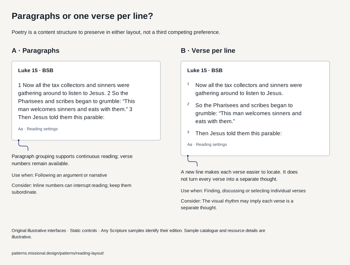
Compare paragraph reading with a separate line for each verse, while preserving the edition’s poetry and structure.
Guidance
Begin with the edition’s paragraph and poetry structure for continuous reading. Offer a verse-per-line preference when reference finding is central, and retain meaningful paragraph and poetry distinctions in either mode.
What tends to go wrong
Flattening poetry into prose; treating verse breaks as sentence boundaries; changing layout and losing the selected passage.
How to test it
Compare sustained reading and reference lookup at large text sizes. Ask readers to locate a verse, change layout and explain where the paragraph ends.
Sources
- Paragraph structure in Scripture dataParagraph definitions reviewed 5 October 2026 · Data-format documentation does not establish which reading layout is best for a person.
- Understanding ReflowOfficial guidance reviewed on 5 October 2026 · Semantic scroll restoration is an original design proposal, not a requirement stated by this criterion.
- Luke 15:1–3, Berean Standard BiblePassage text taken from API.Bible, 9 October 2026 · The diagram’s grouping is a design proposal, not a facsimile of this publisher’s interface.
Earlier pattern: Editorial distinctions survive reflow
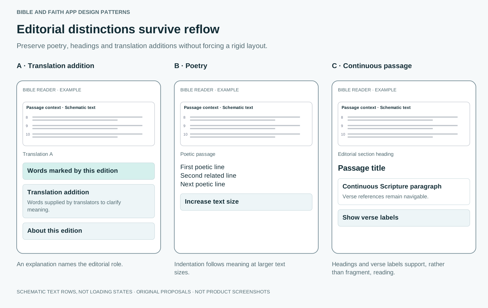
Preserve poetry, headings and translation additions without forcing a rigid layout.
Guidance
Reflow paragraphs and preserve relative poetic structure. Distinguish section headings from Scripture. Explain translator-supplied words when the edition marks them. Verse navigation can coexist with continuous prose.
What tends to go wrong
Shrinking text to preserve a desktop layout; treating each verse as an unrelated box; calling translation additions AI-generated text.
How to test it
Test narrow screens, enlarged fonts and spoken output. Can readers recognise a heading, poetic grouping and a translation addition without relying only on colour?
Sources
- Translation additionsMarker semantics reviewed · Translation additions are not AI additions.
- Poetic paragraphsMarker semantics reviewed · Accessible presentation needs testing beyond import correctness.
- Scripture structure documentationRelevant structure and marker references reviewed · A format is not a complete model of app behaviour, annotations or formation.
- Understanding ReflowGuidance reviewed · Some content has defined exceptions; test the actual experience.
Earlier pattern: Footnotes without losing place
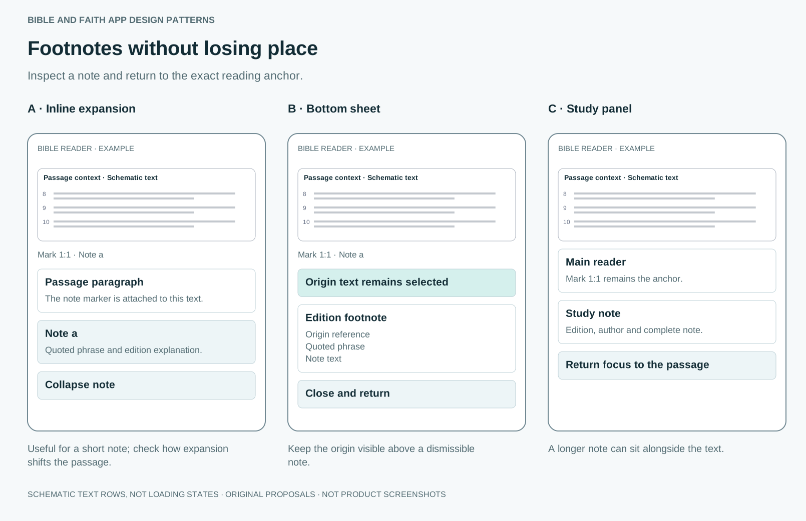
Inspect a note and return to the exact reading anchor.
Guidance
Attach the note to its text anchor and preserve its parts: origin reference, quoted phrase, explanatory text and alternative reading where supplied. Choose inline expansion, a mobile sheet or a study panel by note length and available space.
What tends to go wrong
Hover-only access; a modal with no usable close control; merging quoted wording and editorial explanation; closing to a different reading position.
How to test it
Test opening and closing with touch, keyboard and screen reader at large text sizes. Confirm focus and the visible reading position return to the note anchor.
Sources
- Footnote structureMarker semantics reviewed · Does not prescribe inline, sheet or panel presentation.
- Accessible modal dialog patternInteraction guidance reviewed · Native apps require corresponding platform mechanisms.
Earlier pattern: Adjust reading settings without losing the passage
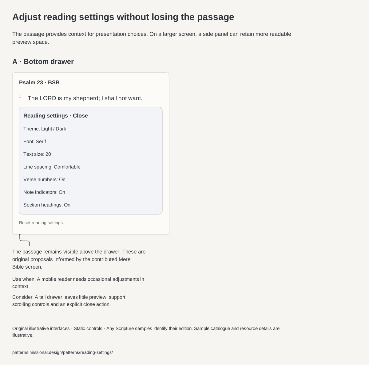
Keep typography, appearance and text-layer preferences close to the reading experience.
Guidance
Offer a labelled reading-settings entry near the passage. A bottom drawer keeps some context visible on mobile; a side panel can retain more readable context on wider screens. Preview typography and appearance against real text. Group font, size and spacing separately from optional verse numbers, notes and section headings. Preserve the semantic reading anchor after reflow. Explain whether changes apply immediately, provide reset, and distinguish persistent preferences from a temporary view.
What tends to go wrong
Tiny slider-only adjustments; unlabeled spacing icons; hiding verse numbers and losing reference access; hiding a note marker as though the note were deleted; fixed drawer height that clips controls at large text; changing edition while claiming to change appearance.
How to test it
Open settings midway through a long chapter, increase text size, change spacing and hide verse numbers. Dismiss and locate the same verse. Repeat with keyboard, screen reader, narrow viewport, poetry and large system text. Test reset and returning after restart if persistence is promised.
Sources
- Mere Bible: contributed reader and picker screenshotsNine images supplied and reviewed 6 October 2026; capture date and build unverified · Still images establish visible states, not gesture timing, accessibility, persistence or exact interaction behaviour.
- Mere Bible: publisher listing and renameReviewed 6 October 2026 · Does not identify the build shown in the contributed screenshots.
- Understanding ReflowOfficial guidance reviewed on 5 October 2026 · Semantic scroll restoration is an original design proposal, not a requirement stated by this criterion.
- Paragraph structure in Scripture dataParagraph definitions reviewed 5 October 2026 · Data-format documentation does not establish which reading layout is best for a person.
- Psalm 23, Berean Standard BiblePassage text taken from API.Bible, 9 October 2026 · A text source, not evidence of the proposed interface’s effectiveness.
Sources and their limits
Research-informed design proposal. Editorial review, not user validation.
- Seductive details: what the research saysSummary reviewed · Learning studies with instructional texts; a secondary summary of the meta-analysis.
- A few of King James’s approved rules for the new translationArticle reviewed · A popular history magazine summary of the rules.
- The Geneva Bible, banned by King JamesArticle reviewed · Secondary popular history.
- Scofield Reference Bible, first editionCollection record reviewed · Influence figures come from secondary accounts.
- The origins of the red-letter BibleArticle reviewed · Publisher’s history article.
- Community Bible ExperienceOverview reviewed · Programme description; outcome claims are the ministry’s own.
- ESV Reader’s BiblePublisher description reviewed · Publisher’s rationale, not a study of its effects.
- Paratexts: Thresholds of InterpretationBook listing and summaries reviewed · Literary theory, not an empirical study.
- Signaling topic structure via headings or preview sentencesAbstract reviewed · Expository texts in lab settings.
- Cognitive load in hypertext reading: a reviewAbstract reviewed · Hypertext research, not Bible apps.
- Dyslexia Friendly Style GuideGuide reviewed · Guidance for general documents.
- Understanding SC 1.4.8: Visual PresentationSpecification guidance reviewed · Level AAA; a strong target rather than a minimum.
- Gordon Fee and Douglas Stuart, How to Read the Bible for All Its WorthBook quotations reviewed · A widely used evangelical introduction to interpretation; one approach among several.
Faith and interpretation
Traditions disagree about apparatus. King James forbade marginal notes because the Geneva notes argued politics and theology; the Scofield notes later carried a whole system of interpretation to millions of readers. Reader’s editions remove everything so the books can be read whole. None of these is neutral: what surrounds the text quietly teaches people how to read it.