Finding a passage
Browse, type a reference, or start from a need?
Someone hears “John 3” in a sermon. Someone else wants Isaiah but isn’t sure where it sits. A third person only wants today’s reading. One picker rarely serves all three, and sometimes the best picker is none at all. Opening the right page for someone is a small hospitality, and the first step of every reading.
- 5 working options
- 9 app examples
- 5 takeaways
- Editorial review, not user-tested
At a glance
Five routes to a passage, side by side
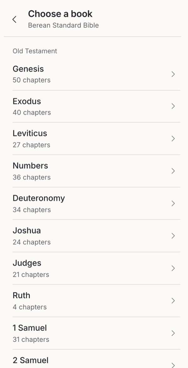 Familiar convention One question per screen Many taps for a known referenceTry it →
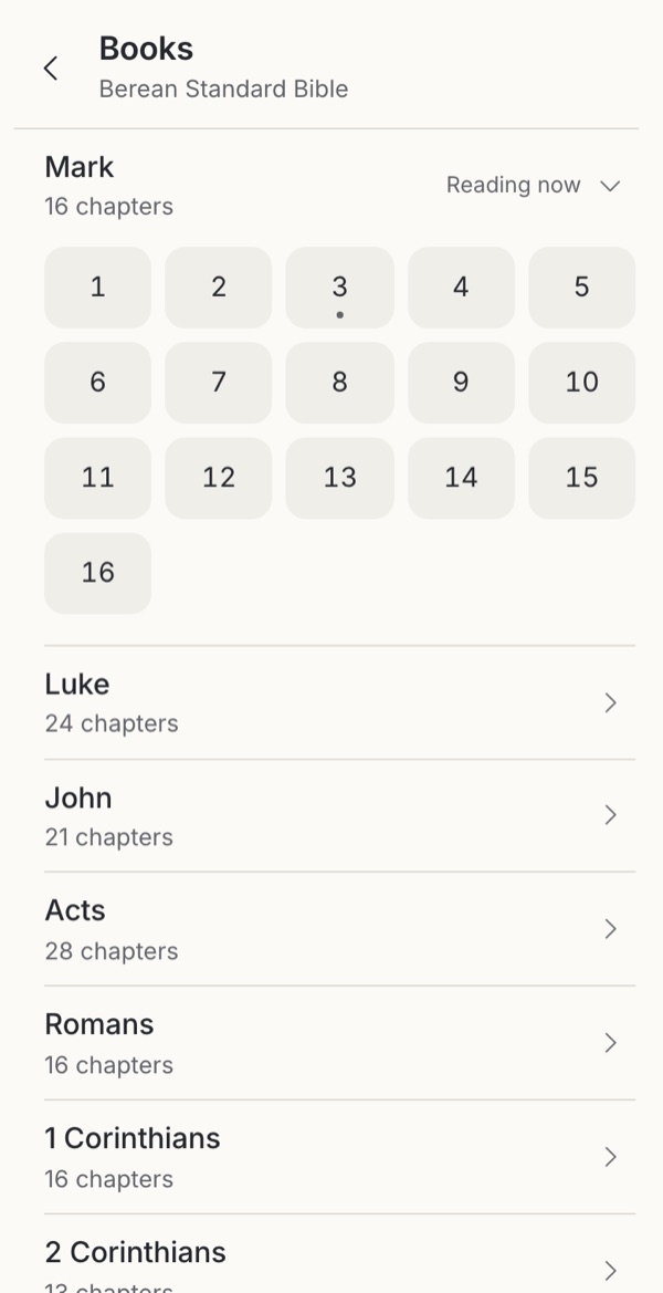 Observed Book context stays in view Long books push the list downTry it →
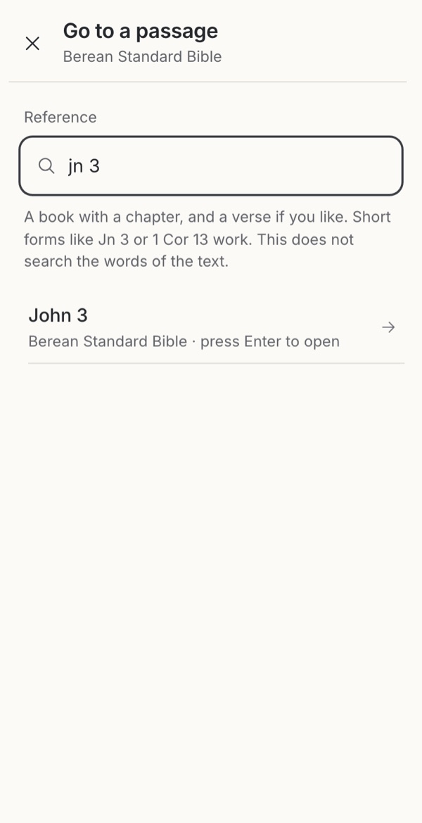 Borrowed Fastest for a known reference Needs the reference and spellingTry it →
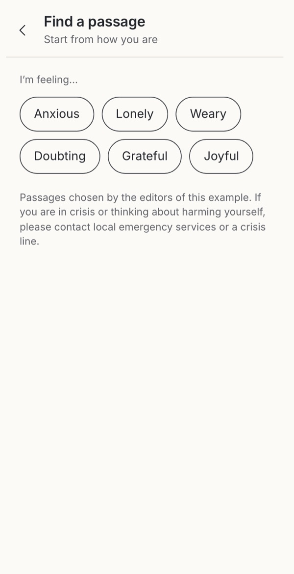 Observed A way in without a reference Someone else chose the versesTry it →
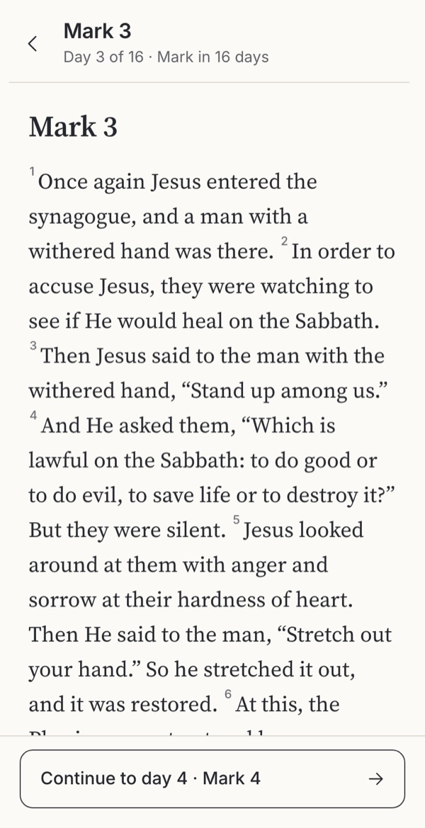 Leave it out Nothing to decide before reading Other passages are out of reachTry it →
Stills from the working example below. Choose one to try it.
Try it
Try five ways to reach a passage
Someone is reading Mark 3. A friend mentions John 3 and they want to look it up. Every example starts at Mark 3 in the Berean Standard Bible. Try reaching John 3, then change your mind and cancel.
Option
Why these settings?
These switches are separate decisions from the options. Opening on tap is faster; reviewing first helps when a mis-tap is costly or the destination is unfamiliar. A book grid fits all 66 books in one view, with no scrolling, at the cost of recognisability: it shows three-character codes (here the USFM identifiers), which suit people who already know the books. A contributed Olive Tree screenshot (undated, captured before May 2026) shows the same idea as a nine-column grid of three-letter codes. A verse step suits study and sermon follow-along, but adds a screen for anyone reading a whole chapter.
Familiar convention
1. Step by step
A widely used structure, generalized here. Not a copy of a particular app.
Try this
Tap “Mark 3”, choose John, then chapter 3. Then switch on the book grid and the verse step and try again.
Makes easier
Each screen asks one question, with large targets. Readers who recognise a book name but do not remember a reference can always get there.
Costs
Several screens for a destination the person already knows. Sixty-six books make a long list; a grid is shorter but relies on abbreviations.
Ask your teamDo most of your readers know where they are going, or are they finding out?
Observed
2. Expandable book list
Observed in Mere Bible and YouVersion: chapters open inside the book list (see the screenshots below). Stills do not show gesture or commit timing, so opening follows the switches below, as in option 1.
Try this
Open the picker. The list opens at Mark with chapter 3 marked. Scroll to John, expand it and choose 3.
Makes easier
Book context stays visible while choosing a chapter, and the reader’s current book opens ready.
Costs
Long books push the rest of the list down. Psalms puts 150 cells inside the list, and the scroll position has to survive a book collapsing.
Ask your teamWill your longest books still be manageable inside a list?
Borrowed
3. Type a reference
Borrowed from address bars and command palettes, where people type a known destination. In a Bible app, the parser decides what counts as a reference.
Try this
Type “jo”, then “jo 3”, then “jn 3:16”. Press Enter to open.
Makes easier
The quickest route to a known reference, such as a sermon slide or a citation in a book.
Costs
It assumes the person knows the reference and can spell it. Ambiguous abbreviations and mistakes need clear help. It looks up references only; it does not search words or use AI.
Ask your teamWhat should happen when someone types something that is not a reference?
Observed
4. Start from a feeling
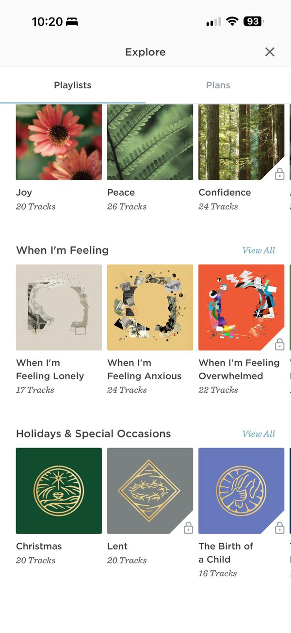
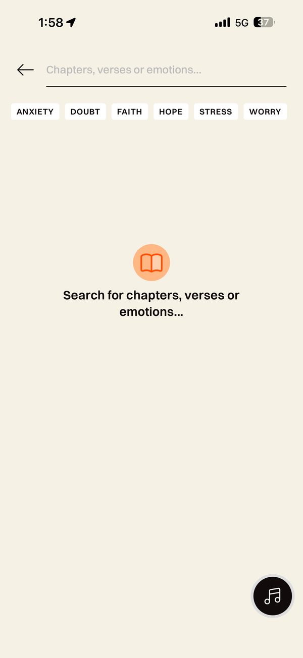
Observed in ESV (“When I’m Feeling” audio playlists) and Glorify (search for “chapters, verses or emotions” with chips such as Anxiety and Doubt); see the screenshots below. The passages in this example are our own illustrative choice.
Try this
Choose “Weary”, then open Matthew 11:28–30. Then go back and look at what the lists leave out.
Makes easier
Someone who does not know where to look can still find a way in, starting from where they are rather than from a reference.
Costs
Someone else has decided which verses answer which feeling. Short lists can turn Scripture into remedies, lift verses out of their context and imply how the reader ought to feel. Acute distress needs more than a verse.
Ask your teamWho chooses the passages for each feeling, and how will readers know?
Leave it out
5. No passage picker
An exploratory proposal for plan- or session-focused readers. Not attributed to a specific app and untested.
Try this
Try to reach John 3. Then use the back arrow to see what the plan offers.
Makes easier
Nothing to decide before reading. The plan supplies the passage and the back arrow returns to the plan, which can suit a guided session, a devotional or a group reading.
Costs
John 3 is out of reach. Someone who wants to follow a reference, check context or wander has to leave for another app or mode.
Ask your teamIs open-ended lookup part of this product’s job, or does it belong somewhere else?
What we noticed
Takeaways
It depends on what the reader already knows
Typing is fastest when the reference is in front of someone, and a wall when it isn’t. Browsing takes more taps but never asks anyone to remember. The expandable list sits between the two: the shape of the book stays in view while you choose.
Leaving it out is a real option
If your product guides people through a plan, a full picker is an exit as much as a feature. Leaving it out keeps the session calm and the scope honest. It also sends someone following a sermon to another app.
A feeling asks a different question
Not “where is it?” but “where should I begin?”. ESV and Glorify both offer it. It welcomes someone with no reference in mind, and hands quiet authority to whoever wrote the lists. Name the curators, open passages in their chapter, and keep acute distress out of a verse menu.
Open on tap; review only when it costs something
Opening on tap is what most people expect. A review step earns its place when a wrong destination is costly, such as changing a group’s shared reading. Going down to the verse helps someone following a sermon and slows down someone reading whole chapters.
Offer both routes, and keep each one plain
Most general Bible readers end up with browsing and typed entry. That works while each route says what it does. A reference field that quietly becomes text search or an AI answer box changes what people expect from it.
Use cases
Which situation, which option?
People come with different needs, sometimes in the same week. Each need fits some options better than others.
| Situation | Needs | 1 Step by step | 2 Expandable book list | 3 Type a reference | 4 Start from a feeling | 5 No passage picker |
|---|---|---|---|---|---|---|
| Following a sermon or talk | A spoken reference, found before the speaker moves on | Possible | Possible | Good fit | Poor fit | Poor fit |
| New to the Bible | Seeing which books exist and where, without typing | Good fit | Good fit | Poor fit | Possible | Poor fit |
| Studying across books | Jumping between references quickly | Poor fit | Possible | Good fit | Poor fit | Poor fit |
| Carrying on with a book | The saved place, then the next chapter | Possible | Possible | Possible | Poor fit | Good fit |
| Looking for comfort, with no reference in mind | A place to begin, with its chapter around it | Poor fit | Poor fit | Poor fit | Good fit | Poor fit |
| A guided plan or group session | Today’s passage without detours | Poor fit | Poor fit | Poor fit | Poor fit | Good fit |
| Screen readers, large text or limited dexterity | Few, large targets and one decision at a time | Good fit | Possible | Good fit | Possible | Good fit |
Editorial judgments drawing on the research below, not test results.
The research behind it
Theology, practice and science
Scripture and tradition
Finding the place
Finding the place is an old practice
In Nazareth, “the scroll of the prophet Isaiah was handed to Him. Unrolling it, He found the place where it was written” (Luke 4:17). Before chapters and verses, passages were named by what happened in them: “have you not read about the burning bush in the Book of Moses?” (Mark 12:26). Chapters date from the thirteenth century and verse numbers from 1551.
Easy access is a stated commitment
The Second Vatican Council asked that “easy access to Sacred Scripture should be provided for all the Christian faithful”. Protestant Bible societies have pursued the same goal through translation and distribution. A picker is where that access succeeds or fails on a phone.
How people arrive
Lookup, suggestion and habit
People reach Scripture in several ways
Lifeway’s 2024 survey finds looking up passages, reading ones suggested by others, rereading favourites and reading systematically overlap in the same people. One route will not serve all of them.
Apps teach a way of reading
Hutchings shows Bible apps are designed as persuasive technologies that train reading habits. By the same logic, a picker that always opens at a verse teaches verse reading, and one that opens at a chapter teaches passages.
Reading on needs no picker
YouVersion documents continuous chapter scrolling and an optional verse picker: for people reading on, the next chapter matters more than a destination.
Interface research
What helps people find
Recognition is easier than recall
Interfaces that show the options ask less of memory than fields that need someone to remember and type. Browsing books and chapters asks people to recognise; a reference field asks them to recall. Offer both.
Forgive the way people type
When input is wrong and a correction is known, suggest it. Accept abbreviations, other languages’ book names and “Psalm” for “Psalms”, and say “Did you mean John 3?” instead of “Not found”.
Many small targets
A grid of 150 Psalms or 176 verses packs many targets into a phone screen. Keep each at least 24 pixels with space between, and let the grid reflow when text is enlarged.
Every source, with what it can and cannot show, is listed under Go further → Sources and their limits.
Where to start
Which fits your product?
IfPeople follow references from a speaker, a book or a study guide
Start withA typed reference, with browsing as the fallback
IfPeople are new to the Bible, or think in books rather than references
Start withStep by step, or the expandable list
IfPeople arrive with a need rather than a reference
Start withStart from a feeling, with named curators and the whole chapter one step away
IfYour product is a guided plan, devotional or group session
Start withConsider no picker, with a clear route to a full Bible elsewhere
These are editorial judgments from design review, not results of user testing.
In real apps
Examples in use
Attributed screenshots with dates and review limits. A screenshot shows an implementation; it does not show that it works for every audience.
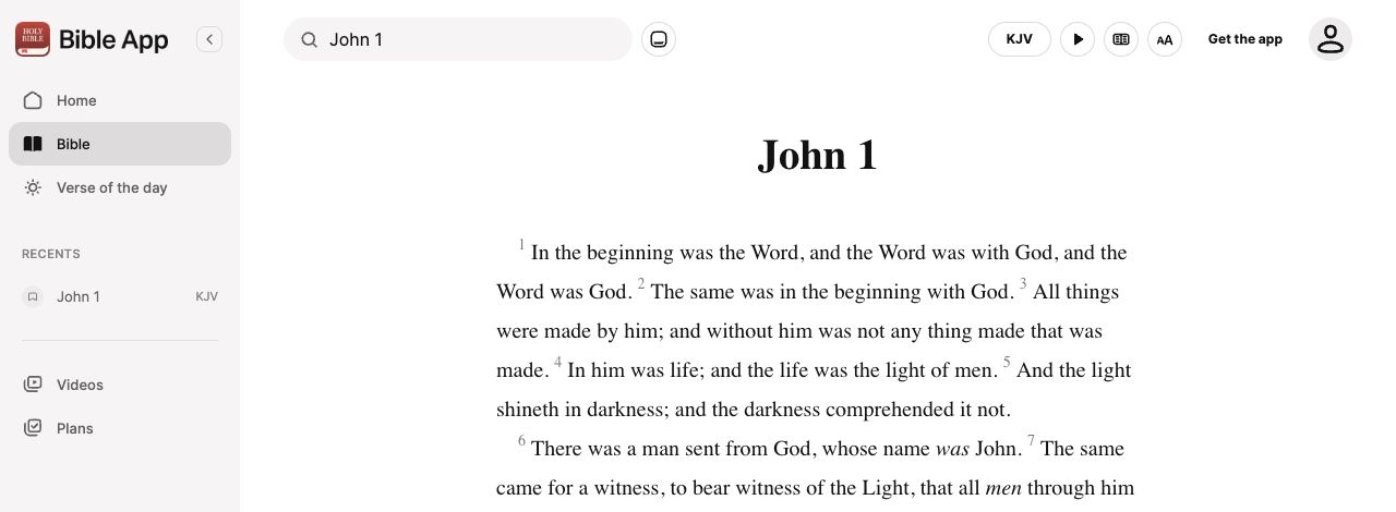 YouVersion · Desktop web
Continuous prose with reader controls
Direct web capture · cropped
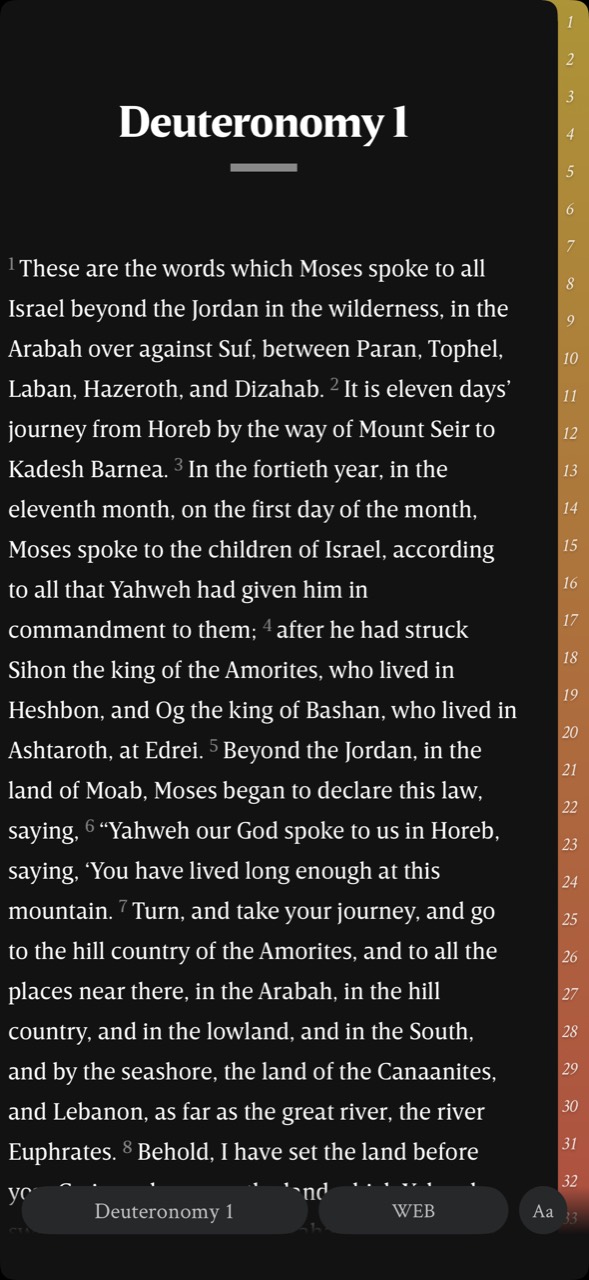 Mere Bible (formerly NeuBible) · Mobile interface · device and OS not independently verified
Chapter navigation beside the reading text
User-contributed screenshot · unedited
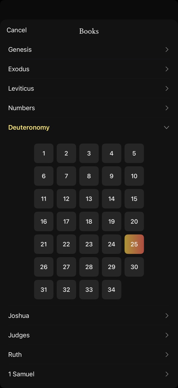 Mere Bible (formerly NeuBible) · Mobile interface · device and OS not independently verified
Book list with an inline chapter grid
User-contributed screenshot · unedited
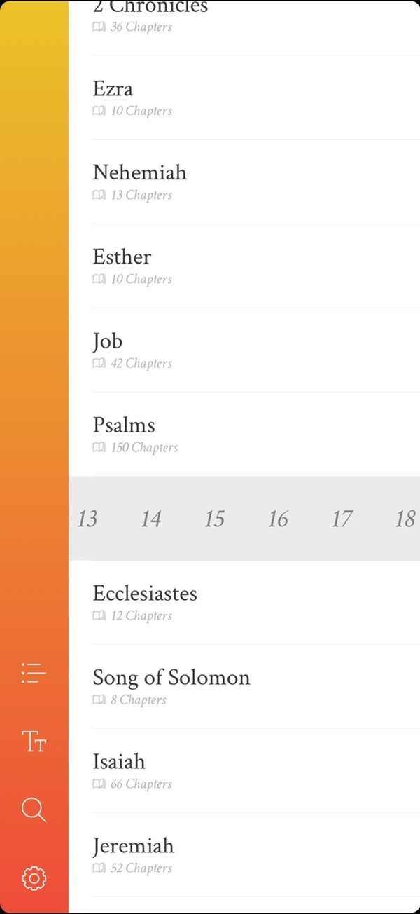 NeuBible (now Mere Bible) · iOS app · device model not recorded
Chapters as a strip inside the book list
User-contributed screenshot · resized, content unchanged
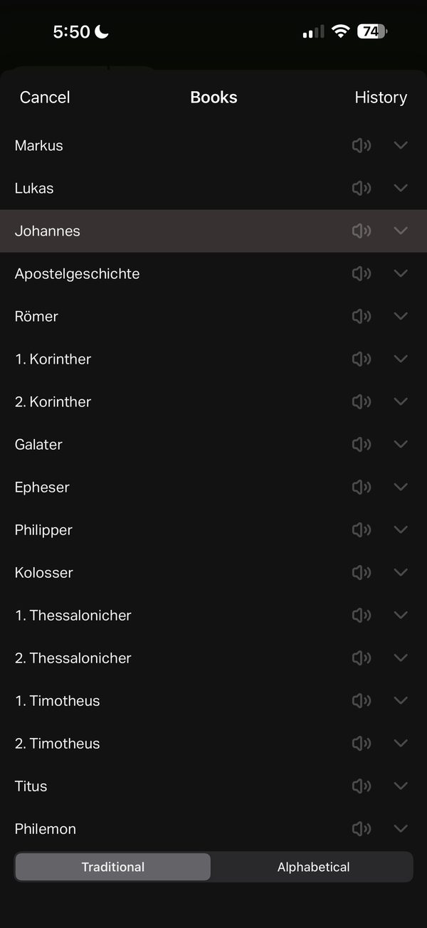 YouVersion · iOS app · device model not recorded
Book list with history, audio markers and two orders
User-contributed screenshot · resized, content unchanged
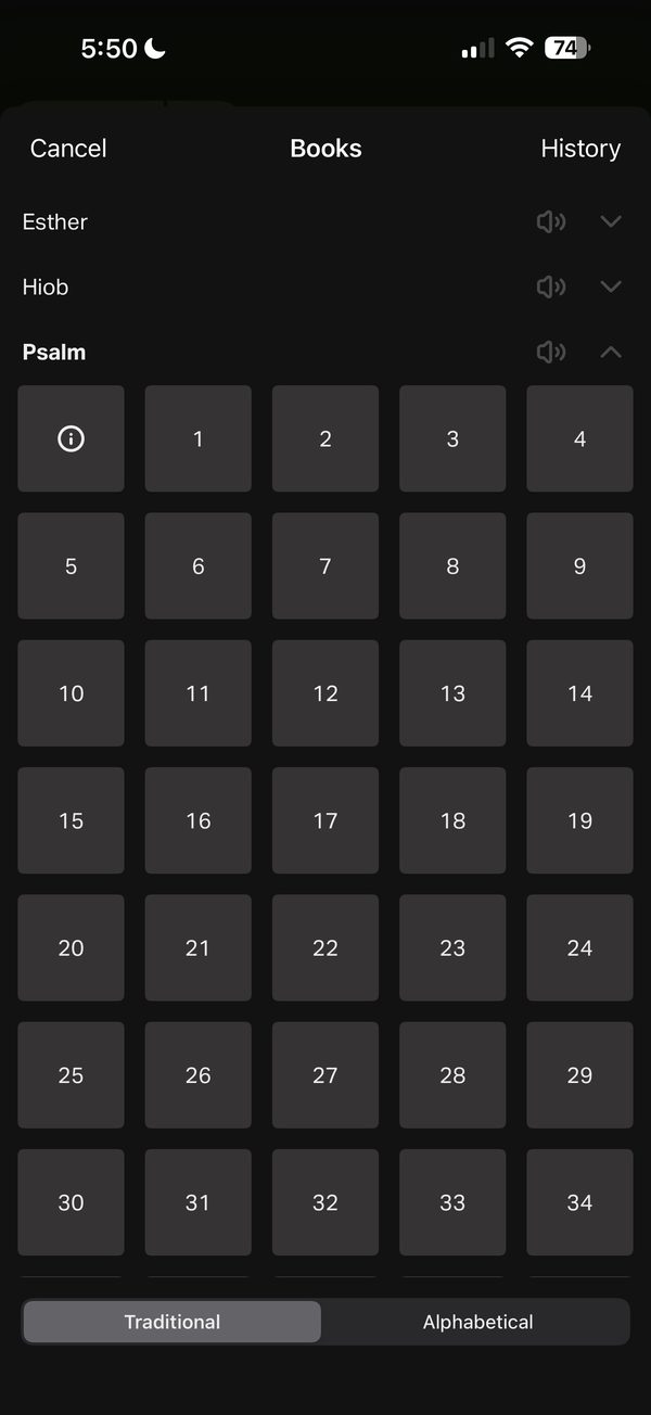 YouVersion · iOS app · device model not recorded
A chapter grid that opens inside the book list
User-contributed screenshot · resized, content unchanged
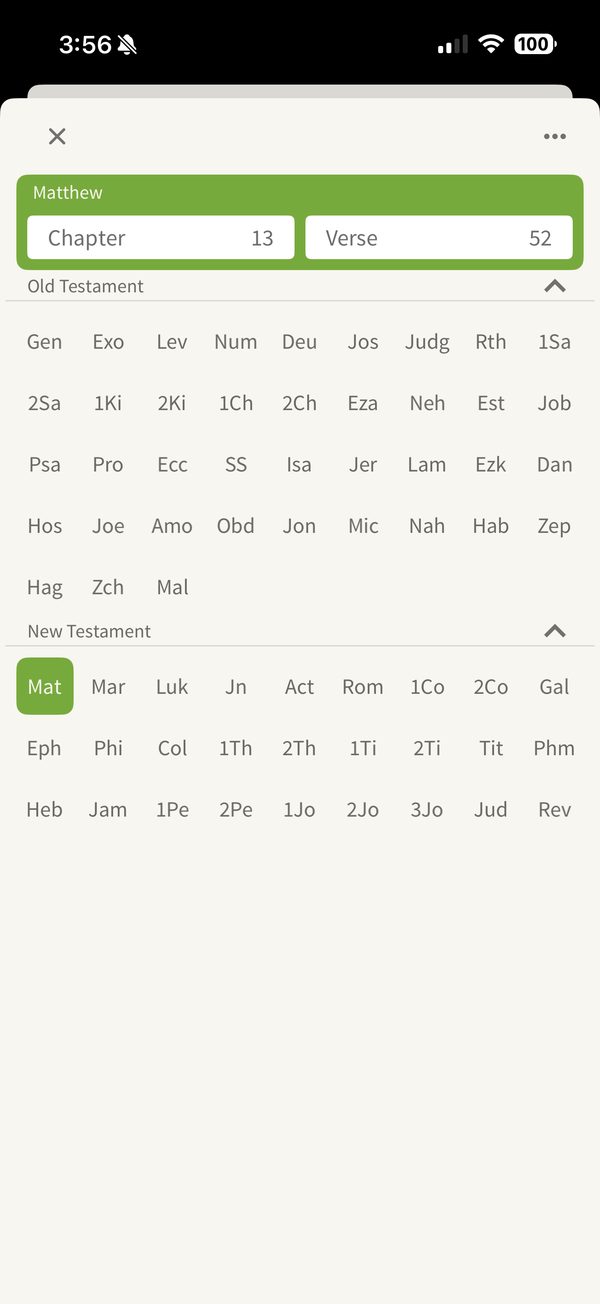 Olive Tree Bible · iOS app · device model not recorded
All 66 books in one view, as three-letter codes
User-contributed screenshot · resized, content unchanged
 ESV Bible · iOS app · device model not recorded
Audio playlists by feeling
User-contributed screenshot · resized, content unchanged
 Glorify · iOS app · device model not recorded
Search for chapters, verses or emotions
User-contributed screenshot · resized, content unchanged
Theological reflection
What is this practice for?
What finding the place is for
In Nazareth, Jesus unrolled the scroll and “found the place where it was written” (Luke 4:17). Knowing where a passage sits, in which book and among which neighbours, is part of understanding it. Finding the place is a small act of attention before reading.
Where Christians differ
The Bible itself is not the same book everywhere. Catholic and Orthodox Bibles include books that most Protestant Bibles omit or place in a separate Apocrypha, and the Hebrew Bible orders its books differently from Christian Old Testaments. Many readers know no references at all and come with a feeling or a story.
What follows for design
Use the canon and book order of the edition being read, and do not impose one tradition’s list on everyone. Serve the reader who knows no references as carefully as the expert, without steering either toward what the publisher wants them to read.
In conversation with
- Second Vatican Council, Dei Verbum (1965) “Easy access to Sacred Scripture should be provided for all the Christian faithful”: finding the passage is the first step of access.
- Martin Luther, Sendbrief vom Dolmetschen (1530) designed his Bible for ordinary people; a picker should serve the reader who knows no references as well as the scholar.
Scripture is quoted from the Berean Standard Bible. This reflection is the editor’s, written from within the Christian tradition and open to correction. How we approach theology here →
Three ways to build
What would each way do here?
ExploitativeTakes from the person
Promoted content stands between the reader and the passage they asked for.
EthicalDoes no harm
Make lookup fast and accessible for people who know a reference.
RedemptiveGives something up for them
Invest as much in people who know no references, without steering them to what you want them to read.
The three ways are Praxis’s frame for redemptive entrepreneurship; their application here is ours. Why we use it, and its limits →
Take into your next review
Do most of the people you serve know where they are going, or are they finding out?
Exercise
Watch three people find a chapter you name aloud, then one they choose themselves. Note where each one hesitates, and whether they ever needed a route you didn’t offer.
Getting someone to the right page is the first hospitality of every reading.
Record the decision with the worksheet →
Something missing or wrong here? Send a correction or suggest a topic.
Details
Go further
This deep dive brings together 4 earlier patterns. Their guidance, wireframes and sources are kept below; their old addresses lead here.
Edge cases to design for
Offer book browsing and direct reference entry as complementary routes. Preserve the current location, make back and cancel predictable, and show the full destination before opening a parsed reference.
What tends to go wrong
Unexplained abbreviations; assuming every edition has the same book list; resetting book selection on back; accepting an ambiguous reference without clarification.
How to test it
Locate an unfamiliar book, enter an abbreviated range, cancel after choosing a chapter and return to the original verse. Test long book names, different canons, large text and one-chapter books.
How the example is built, and what it leaves out
Built with React, Tailwind and an adapted shadcn/ui Button, styled with the paper visual vocabulary used across these examples. Input stays in browser memory. The examples do not request an AI response, load more than a few verses of Bible text or save reading history.
Escape cancels. Opening or cancelling returns focus to the reader’s passage button, and each new screen moves focus to its heading. Chapter cells are ordinary toggle buttons, not an ARIA grid. The comparison selector follows the ARIA tabs pattern.
A production implementation still needs a licensed content catalogue, edition-specific book and chapter availability, loading and error states, and testing with assistive technology. The visual style is illustrative, not a required brand treatment.
Other approaches are not shown here: separate or combined translation, book and chapter controls; a two-pane browser on wider screens; verse and range selection; Mere Bible’s chapter rail beside the text; a single field that combines book filtering, references and AI suggestions; and different canons or book orders.
Earlier pattern: A reference opens at a deliberate destination
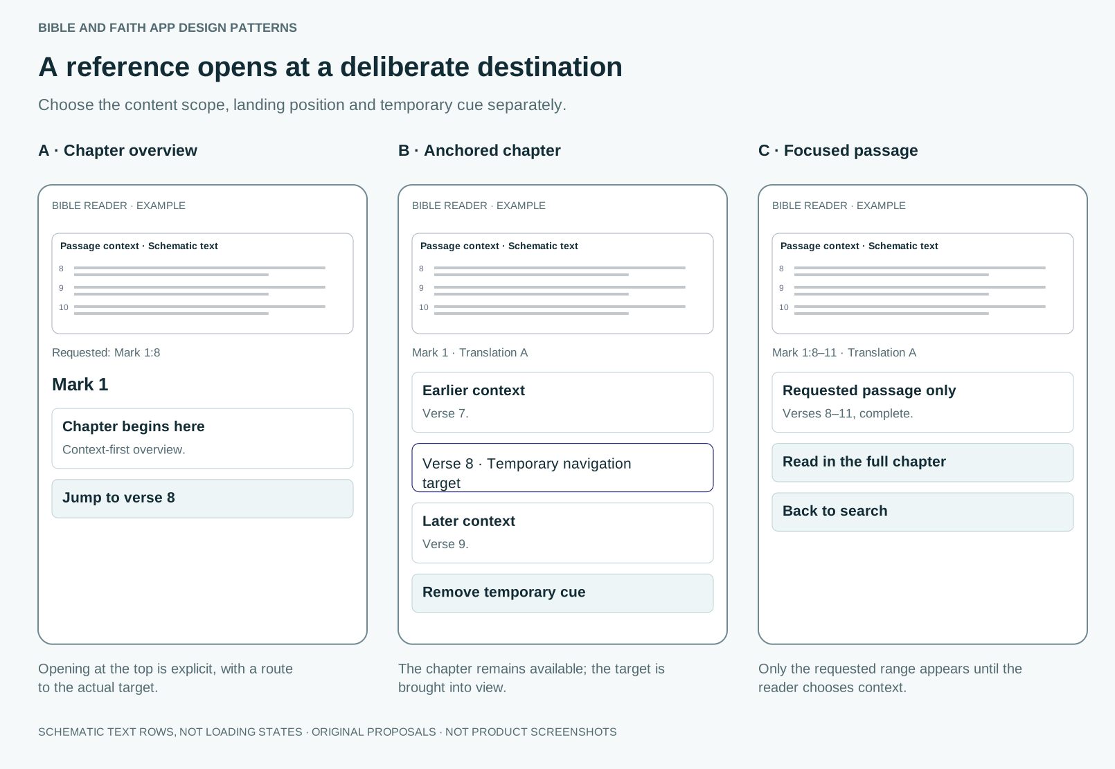
Choose the content scope, landing position and temporary cue separately.
Guidance
For contextual reading, open the containing chapter and place the first requested verse in view. For a focused preview, show only the verse or requested passage with a Read in context action. A chapter overview may open at the top, but retain the requested reference and provide Jump to verse. Scrolling and highlighting are independent: landing at a verse can use a temporary outline, a labelled margin cue, or no highlight. Mark a requested range rather than only its first verse when helpful. Temporary navigation cues never become saved annotations. Account for headers, players and delayed layout; retain back navigation to the search or chat.
What tends to go wrong
Opening at the chapter top without acknowledging the requested verse; permanently marking a deep-link target; hiding a focused excerpt’s boundaries; losing the origin.
How to test it
Enter one verse, a range and a cross-chapter passage from search, chat and an external link. Check large text, cold loading, missing content and return navigation.
Sources
- Scripture structure documentationRelevant structure and marker references reviewed · A format is not a complete model of app behaviour, annotations or formation.
- Understanding ReflowOfficial guidance reviewed on 5 October 2026 · Semantic scroll restoration is an original design proposal, not a requirement stated by this criterion.
Earlier pattern: Book and chapter pickers: list, grid or drill-down?
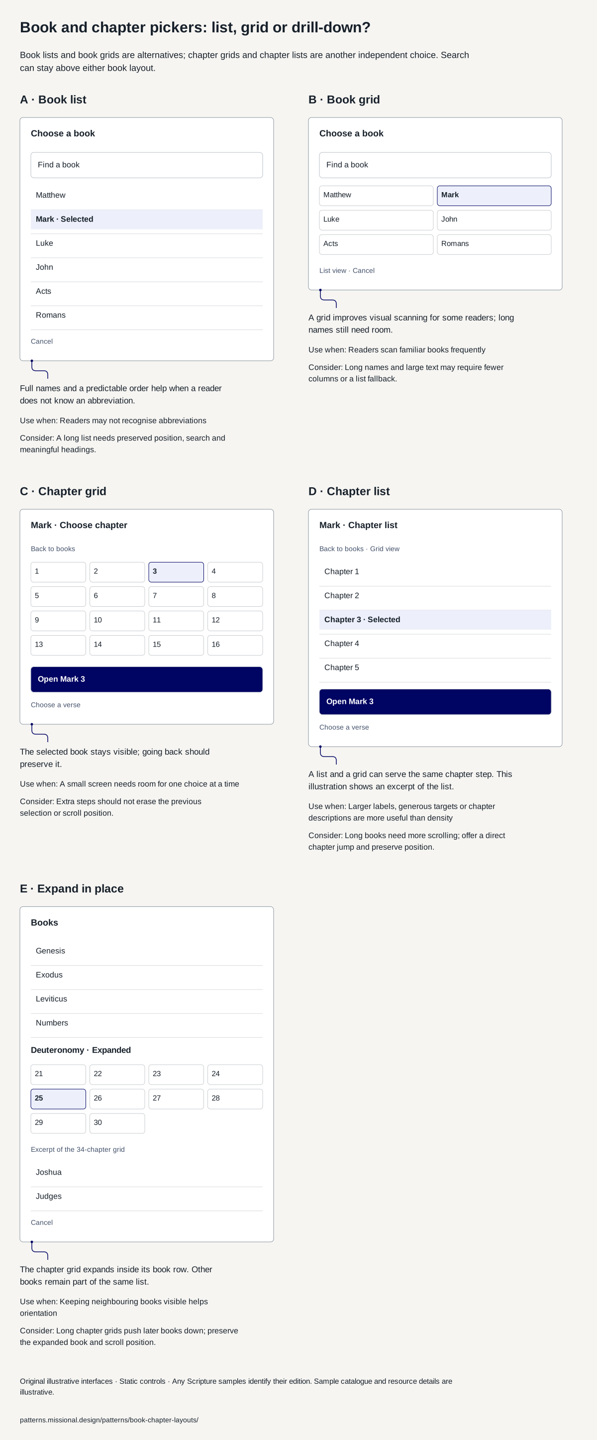
Choose the browsing shape independently from the search field.
Guidance
Start with full book names and a clear selected state. Compare a list, a compact grid and progressive book-to-chapter selection for the intended readers. Keep search available, preserve the current location on cancel, and use the selected edition’s actual book and chapter availability.
What tends to go wrong
Unexplained abbreviations; tiny grid targets; assuming one canon or ordering; losing the list position when returning from a chapter; an unavailable book silently opening elsewhere.
How to test it
Find an unfamiliar book, select a chapter, go back and cancel. Repeat with long translated names, enlarged text, a one-chapter book and missing edition coverage.
Sources
- Scripture structure documentationRelevant structure and marker references reviewed · A format is not a complete model of app behaviour, annotations or formation.
- Understanding ReflowOfficial guidance reviewed on 5 October 2026 · Semantic scroll restoration is an original design proposal, not a requirement stated by this criterion.
- VSB prototype: combined passage pickerBookChapterDropdown and reader header implementation reviewed 6 October 2026 · Local code review, not a device test or user study. Non-reference input triggers the AI endpoint after 450 ms, including partial book names; complete recognised references suppress that request. No exact verse-text corpus search or separate sourced inline-answer view established. Explicit text labels in this library are editorial proposals.
- Mere Bible: contributed reader and picker screenshotsNine images supplied and reviewed 6 October 2026; capture date and build unverified · Still images establish visible states, not gesture timing, accessibility, persistence or exact interaction behaviour.
- Mere Bible: publisher listing and renameReviewed 6 October 2026 · Does not identify the build shown in the contributed screenshots.
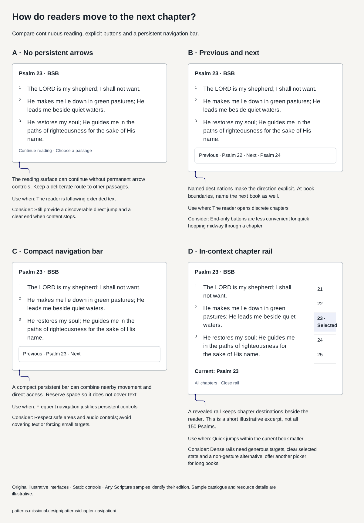
Earlier pattern: How do readers move to the next chapter?
Compare continuous reading, explicit buttons and a persistent navigation bar.
Guidance
Match navigation to the current task, not a permanent reader category. Continuous reading can cross a visible chapter boundary without permanent arrows. Discrete chapters benefit from explicit previous and next destinations. A compact bar suits frequent movement, while study may additionally need a back trail, saved place and direct reference entry. A bounded passage can end without a prominent Next action; retain optional wider context where useful. Keep controls clear of the final lines, audio controls and selection tools.
What tends to go wrong
Swipe-only navigation; wrapping from the last book to the first without warning; hiding the last verse behind a bar; changing chapter during text selection; a missing download leaving a blank page.
How to test it
Give participants different tasks: continue a narrative, compare distant references, follow a spoken reference, resume a note and finish one shared passage. Observe misnavigation, return to place and unwanted interruptions. Ask whether they wanted a next step; do not infer usefulness from the number of chapters opened. Include large text, assistive technology and unavailable chapters.
Sources
- Android reader: chapter navigation and verse pickerReader settings reviewed 5 October 2026 · Documentation evidence, not a current screenshot or verification of exact toolbar geometry.
- Bibel TV app: navigation and searchProvider overview reviewed 5 October 2026 · Provider description; exact current bar layout and interaction behaviour were not inspected.
- Understanding ReflowOfficial guidance reviewed on 5 October 2026 · Semantic scroll restoration is an original design proposal, not a requirement stated by this criterion.
- Psalm 23, Berean Standard BiblePassage text taken from API.Bible, 9 October 2026 · A text source, not evidence of the proposed interface’s effectiveness.
- Mere Bible: contributed reader and picker screenshotsNine images supplied and reviewed 6 October 2026; capture date and build unverified · Still images establish visible states, not gesture timing, accessibility, persistence or exact interaction behaviour.
- Mere Bible: publisher listing and renameReviewed 6 October 2026 · Does not identify the build shown in the contributed screenshots.
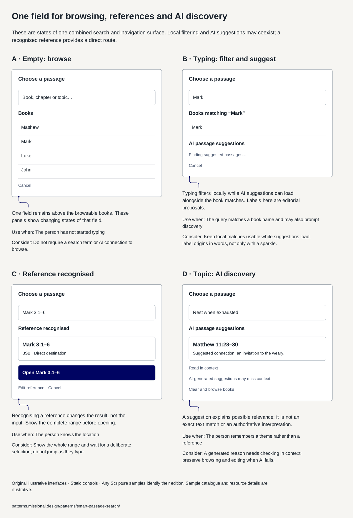
Earlier pattern: One field for browsing, references and AI discovery
Let one input filter books, recognise a reference and suggest passages, while making each result’s origin clear.
Guidance
Keep one field above the book browser. As the person types, filter book names immediately and recognise complete references locally. Other queries can request AI-assisted passage suggestions after a pause, with book matches and suggestions visible together. Prioritise a resolved reference, preserve the query and make opening a deliberate action. Clearly label AI suggestions and any exact text matches as different kinds of result. A separate full-text search service or sourced answer preview is an additional capability, not implied by a unified field.
What tends to go wrong
Presenting type-ahead filtering, direct references and AI suggestions as separate mandatory modes; sending unfinished references without a clear policy; allowing late suggestions to replace current results; describing AI suggestions as exact wording matches; jumping before the person finishes a range.
How to test it
Start empty, type a partial book name, extend it into a reference and then a range, and replace it with a topic. Check coexisting result groups, loading, network failure, no matches, stale responses, keyboard focus, editing before opening and returning from a chapter grid. Inspect what text is sent remotely and when.
Sources
- VSB prototype: combined passage pickerBookChapterDropdown and reader header implementation reviewed 6 October 2026 · Local code review, not a device test or user study. Non-reference input triggers the AI endpoint after 450 ms, including partial book names; complete recognised references suppress that request. No exact verse-text corpus search or separate sourced inline-answer view established. Explicit text labels in this library are editorial proposals.
- Bibel TV app: navigation and searchProvider overview reviewed 5 October 2026 · Provider description; exact current bar layout and interaction behaviour were not inspected.
- The Shape of AICatalogue and named entries reviewed · The site states CC BY NC SA. This reference uses original text and original wireframes; it does not reproduce the source illustrations.
- Understanding ReflowOfficial guidance reviewed on 5 October 2026 · Semantic scroll restoration is an original design proposal, not a requirement stated by this criterion.
Sources and their limits
Editorial design proposal. Editorial review, not user validation.
- Scripture structure documentationRelevant structure and marker references reviewed · A format is not a complete model of app behaviour, annotations or formation.
- Understanding ReflowOfficial guidance reviewed on 5 October 2026 · Semantic scroll restoration is an original design proposal, not a requirement stated by this criterion.
- Mere Bible: contributed reader and picker screenshotsNine images supplied and reviewed 6 October 2026; capture date and build unverified · Still images establish visible states, not gesture timing, accessibility, persistence or exact interaction behaviour.
- Mere Bible: publisher listing and renameReviewed 6 October 2026 · Does not identify the build shown in the contributed screenshots.
- Dogmatic Constitution on Divine Revelation, Dei VerbumParagraphs 22 and 25 reviewed · Catholic magisterial teaching.
- Americans’ Bible reading · August 2024 survey, published 2025Methods and reading-approach results reviewed · US online self-report, weighted sample of 1,200; approach question limited to 1,137 who had read any Bible. Multiple selections permitted.
- Design and the digital Bible: persuasive technology and religious readingAbstract reviewed · Design analysis of two apps; not a study of readers.
- Android reader: chapter navigation and verse pickerReader settings reviewed 5 October 2026 · Documentation evidence, not a current screenshot or verification of exact toolbar geometry.
- Memory recognition and recall in user interfacesArticle reviewed · Practitioner guidance drawing on memory research.
- Understanding SC 3.3.3: Error SuggestionUnderstanding document reviewed · A conformance criterion, not a usability study.
- Understanding SC 2.5.8: Target Size (Minimum)Understanding document reviewed · A minimum, not a recommendation; larger targets help more people.
Faith and interpretation
Use the selected edition’s book list and ordering. Group labels should describe the edition rather than impose one tradition’s canon on all readers.