Actions on AI answers
Copy, share, try again, report: which belong?
Under every answer, AI apps now offer a row of icons: copy, share, save, read aloud, try again, make it simpler, branch, double-check, thumbs up and down, report a legal issue. Each one makes a promise about where the answer goes, who sees the feedback and what the model did. In a Bible app, a shared answer can also be mistaken for Scripture. Each action is a chance to send people back to the text, or away from it.
- 4 working options
- 2 app examples
- 4 takeaways
- Editorial review, not user-tested
At a glance
Four action bars, side by side
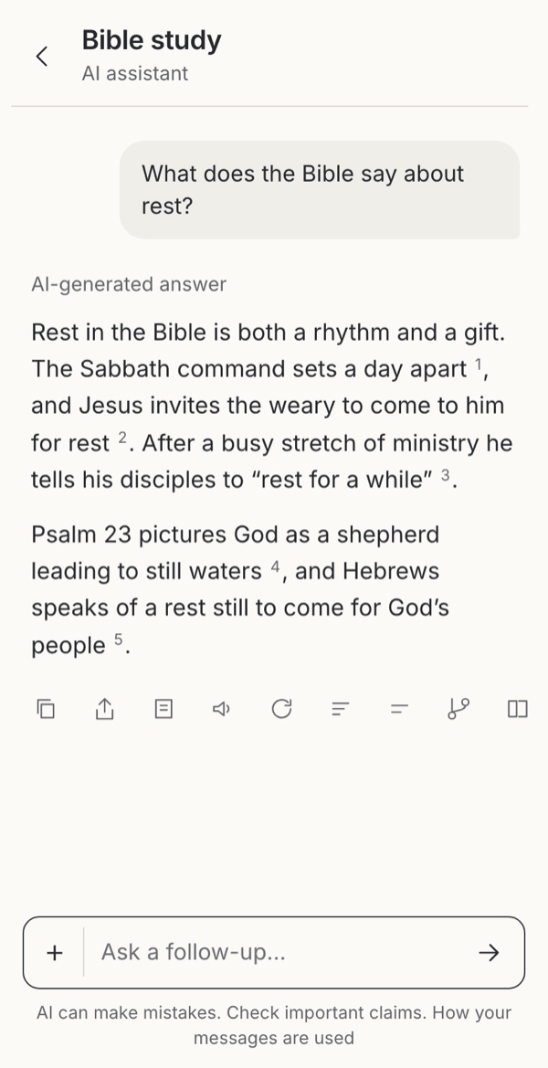 Borrowed Everything one tap away Fourteen unlabelled iconsTry it →
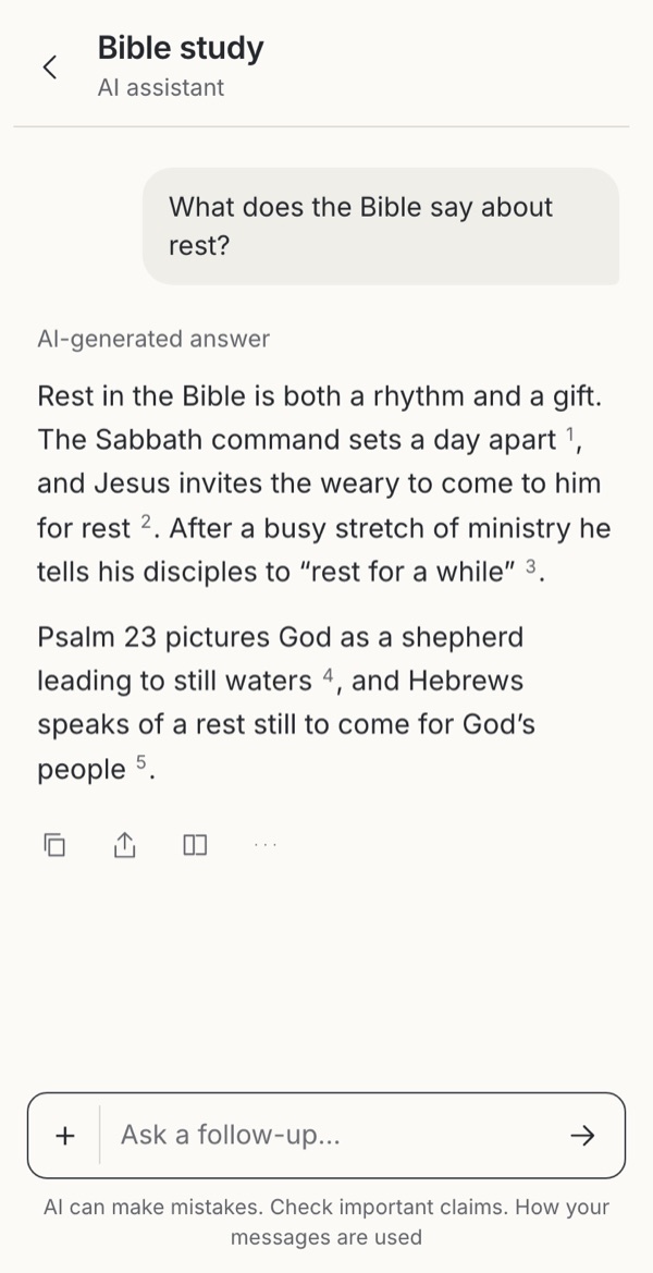 Borrowed The common three, clearly Rating is one tap furtherTry it →
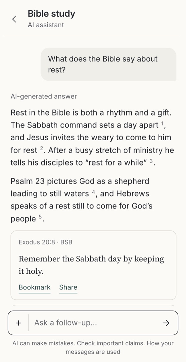 Observed Scripture is what travels Harder to keep the answerTry it →
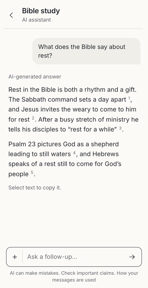 Leave it out A quiet, reflective screen No way to report problemsTry it →
Stills from the working example below. Choose one to try it.
Try it
Try four ways to act on an answer
One answer about rest, four ways of offering actions on it. Try copying, sharing, rating and asking what the assistant did, and watch what each action says it will do.
Option
Borrowed
1. Every action in a row
Borrowed from general AI apps: Gemini (good/bad, share and export, double-check, modify, report legal issue), ChatGPT (copy, read aloud, branch in new chat, try again) and Claude (copy, try again, thumbs with an issue type).
Try this
Without tapping, guess what each icon does. Then try Make it simpler, Read aloud and Report.
Makes easier
Everything is one tap away for people who use it often.
Costs
Fourteen unlabelled icons scroll off the side of a phone, and the ones that matter most look the same as the rest.
Ask your teamWhich three of these would your readers miss?
Borrowed
2. Three, then More
Common in chat and content apps: the main actions visible, the rest in a menu with labels.
Try this
Open More: actions are grouped as Keep, Change, Check and Tell us. Try Branch, then come back.
Makes easier
Copy, share and sources are easy to find, and the rest are labelled in words.
Costs
Rating, branching and reporting take one more tap, so they are used less.
Ask your teamWhat do you lose if fewer people rate or report answers?
Observed
3. Actions on the passages
Observed in BibleAI, where each passage card has its own Bookmark and Share (see the citations page); generalized here.
Try this
Share a passage card and read what is shared.
Makes easier
What people save and pass on is Scripture with its reference, not generated interpretation.
Costs
The answer itself can’t be copied, rated or reported from here, so the team learns less about where it fails.
Ask your teamShould your app make the answer or the passage the thing that travels?
Leave it out
4. No action bar
Leave the bar out: the answer is just text, and people select it to copy.
Try this
Try to share or rate the answer.
Makes easier
A quieter screen with nothing to tap, which can suit reflective use.
Costs
Copying loses the AI label and references, nobody can report a problem, and the team hears nothing.
Ask your teamWhere else would people go to tell you an answer was wrong?
What we noticed
Takeaways
Two or three actions, the rest behind More
Ten unlabelled icons are a puzzle on a phone. Most people need two or three actions; the rest are easier to understand as labelled rows behind “More”.
What travels matters most
A copy or share should carry the label and the references, so whoever receives it can tell generated interpretation from Scripture or a pastor’s words. Making the passage, not the answer, the thing people save and share is stronger still.
Changing the answer needs care
Try again can become shopping for the doctrinal answer someone hoped for, so keep every version visible and the original first. Simpler and shorter versions help readers at different levels. Checking quotations against the edition catches misquoted verses but cannot judge the interpretation.
Feedback and “thinking” need honesty
Thumbs should say who reads them and whether they train models. A list of steps should describe what the service actually did, such as searching and checking quotations, not present the model’s reasoning as proof. A report button needs a named owner and a response time.
Use cases
Which situation, which option?
People come with different needs, sometimes in the same week. Each need fits some options better than others.
| Situation | Needs | 1 Every action in a row | 2 Three, then More | 3 Actions on the passages | 4 No action bar |
|---|---|---|---|---|---|
| Reading an answer once | Nothing in the way of the text | Poor fit | Possible | Possible | Good fit |
| Sending it to a friend or group | The label and references travel with it | Possible | Good fit | Good fit | Poor fit |
| Keeping it for later study | Saved apart from their own notes | Possible | Good fit | Good fit | Poor fit |
| The answer looks wrong | A way to check or report, with a named owner | Good fit | Good fit | Possible | Possible |
| Wanting it simpler or shorter | A new version that keeps the original | Good fit | Possible | Poor fit | Poor fit |
| Screen readers or large text | Few, labelled actions | Poor fit | Good fit | Possible | Good fit |
Editorial judgments drawing on the research below, not test results.
The research behind it
Theology, practice and science
Scripture and tradition
Holding answers lightly
Test, then keep what is good
“Test all things. Hold fast to what is good” (1 Thessalonians 5:21). Checking a quotation, comparing versions and reporting a problem are ways of testing; saving and sharing are ways of holding fast, and should carry what was tested.
Research and guidance
What each action promises
Icons need words
Few icons are recognised by everyone, and labels revealed on hover do not work on touch screens. Label the actions people need, and put the rest in a labelled menu.
Say what feedback does
Human–AI interaction guidelines ask products to make clear what the system can do, how well, and what happens when people correct it. Thumbs that train a model and thumbs read by a pastor are different promises.
Regenerating can become shopping
Assistants sometimes favour agreeing over accuracy; trying again until the answer agrees compounds it. Keep the original first and every version visible.
Checking changes trust
People trust cited answers more, even with random citations, and less once they check. A check action that opens the verses builds the right kind of trust.
Overreliance is a known risk
NIST lists overreliance among the risks of human–AI configuration. Actions that make an answer easier to keep and spread than to question add to it.
Every source, with what it can and cannot show, is listed under Go further → Sources and their limits.
Where to start
Which fits your product?
IfAnswers are mostly read and occasionally kept
Start withCopy, share and sources visible, everything else behind More
IfThe team depends on feedback to improve answers
Start withKeep rating visible, and say clearly what happens to it
IfThe product exists to lead people into the text
Start withPut bookmark and share on the passages instead of the answer
IfReflective use, with little to do afterwards
Start withNo bar, but keep a way to report problems
These are editorial judgments from design review, not results of user testing.
In real apps
Examples in use
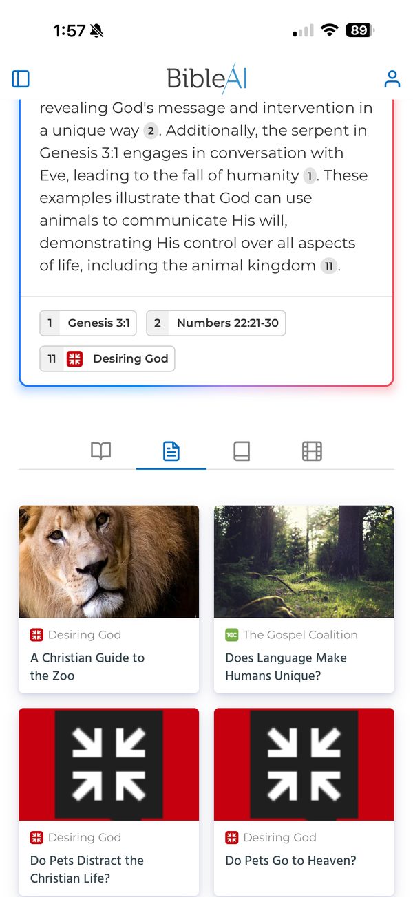
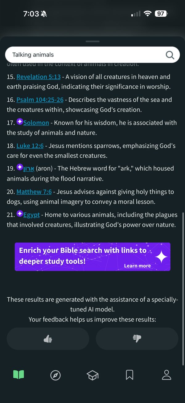
Attributed screenshots with dates and review limits. A screenshot shows an implementation; it does not show that it works for every audience.
Theological reflection
What is this practice for?
What doing is for
“Be doers of the word, and not hearers only” (James 1:22). Reading Scripture leads outward: to prayer, to obedience, to other people. The disciples on the road to Emmaus, their hearts burning, went straight back to Jerusalem to tell the others (Luke 24:32–33).
Where Christians differ
Christians share Scripture in many ways: verse cards, tracts, social media, a text to a friend. Some traditions encourage personal sharing; others prefer that teaching come through the church. All would distinguish the word of God from commentary on it.
What follows for design
“Let him who has My word speak it truthfully. For what is straw compared to grain?” (Jeremiah 23:28). Let the passage, not the generated text, be what people save and share, and label everything else. The best actions lead out of the app: read the whole passage, pray, talk to someone.
In conversation with
- Albert Borgmann, Technology and the Character of Contemporary Life (1984) urged using technology to support focal practices rather than supplant them; the best action ends the session and begins the practice.
- Dietrich Bonhoeffer, Life Together (1939) saw Scripture as received in community; sharing a passage with a friend is closer to that than sharing generated text.
Scripture is quoted from the Berean Standard Bible. This reflection is the editor’s, written from within the Christian tradition and open to correction. How we approach theology here →
Three ways to build
What would each way do here?
ExploitativeTakes from the person
Generated text shared as if it were Scripture; prompts to keep chatting.
EthicalDoes no harm
Label generated text and keep Scripture distinct from it.
RedemptiveGives something up for them
Offer actions that lead away from the app: read the passage, pray, talk to someone.
The three ways are Praxis’s frame for redemptive entrepreneurship; their application here is ours. Why we use it, and its limits →
Take into your next review
Which actions does this product need, and what does each one carry with it?
Exercise
Ask three people to name every icon before tapping it. Then copy and share an answer and look at what arrives on the other end, and ask each person who they think reads their thumbs down.
Make the text easier to keep and share than the answer about it.
Record the decision with the worksheet →
Something missing or wrong here? Send a correction or suggest a topic.
Details
Go further
Edge cases to design for
Decide which actions this product needs. Keep two or three visible and put the rest behind “More”. Copy and share carry the AI label and references; saving to notes keeps AI answers apart from the reader’s own words; feedback says who sees it and whether it trains models; try again and simpler versions keep the original and let people compare, because regenerating until a preferred doctrinal answer appears is a real risk; checking quotations compares every quotation with the edition; “what the assistant did” lists real operations rather than private reasoning; reporting routes to a person with a stated response time. Consider putting actions on the Scripture objects instead, so the passage, not the generated text, is what travels.
What tends to go wrong
Icon-only rows without accessible names; a copy that drops the AI label; thumbs that silently feed training; “thinking” presented as proof of correctness; a report button with no stated owner; sharing generated interpretation as if it were Scripture.
How to test it
Ask people to say what each icon does before tapping it. Copy and share an answer and check what the recipient sees. Rate an answer and ask who they think will read the rating. Compare a full row with three actions plus “More” for findability and errors.
Sources and their limits
Editorial design proposal. Editorial review, not user validation.
- Send feedback or report a problem with Gemini AppsHelp article reviewed 7 October 2026 · Google help documentation; current interface and options may differ by platform and region.
- Learn about responses from Gemini AppsHelp article reviewed 7 October 2026 · Google help documentation; double-checking against web search is not the same as checking quotations against a Bible edition.
- ChatGPT now allows you to branch conversationsNews report reviewed 7 October 2026 · Secondary news report, not OpenAI documentation; interface details may have changed.
- Claude is providing incorrect or misleading responsesHelp article reviewed 7 October 2026 · Anthropic help documentation; does not describe every response action.
- Mental models: expectations of human-like interactionHuman-like interaction section reviewed 6 October 2026 · Industry framework; not a controlled comparison of faith-app typing indicators.
- Generative AI Profile: Human–AI ConfigurationSection 2.7 reviewed 6 October 2026 · Risk framework, not evidence that one visual cue causes an outcome.
- Icon usabilityArticle reviewed · Practitioner guidance from usability testing, not a controlled study.
- Guidelines for Human-AI InteractionOfficial guideline overview reviewed · General guidelines; disclosure alone does not establish accuracy, safety or spiritual benefit.
- Towards understanding sycophancy in language modelsAuthor research abstract reviewed on 5 October 2026; full paper not reviewed · Specific studied models and tasks; not a faith-app intervention study.
- Citations and trust in LLM generated responsesAbstract reviewed · An online experiment with general questions; effects in religious study may differ.
Faith and interpretation
What travels beyond the conversation matters. A shared answer may be read as Scripture, as the church’s teaching or as a friend’s counsel. Letting the passage, rather than the generated text, be the thing people save and share keeps the Bible and its interpretation distinct.