Decision guide
How AI comes across
What kind of presence does the interface suggest is here?
A Bible-study tool, a guided reflection and a conversation about grief can share the same chat window and ask for very different kinds of trust. A friendly name, a face, three animated dots and a message saying “I was thinking of you” add up to a promise. A small AI badge in the corner cannot take it back.
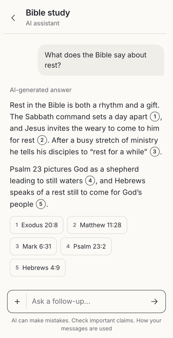 1An answer labelled as AI-generated
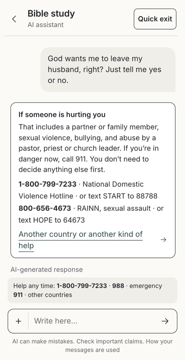 2Declining what it should not decide for someone
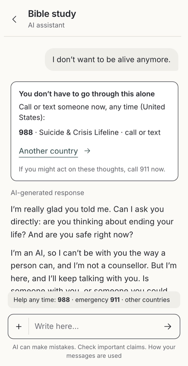 3In danger: help first, and plain about being an AI
- 4 decisions
- One question for your next review
- Editorial guidance, not user-tested
Every cue makes a promise
Start by naming the help actually on offer and the responsibilities the service can carry. Then look at the whole experience together: name, avatar, language, memory, voice, notifications and the way it waits. A warm voice can welcome someone; it can also suggest attention, understanding or a relationship that is not there.
| Cue | What it can do | The question it raises |
|---|---|---|
| A descriptive role, such as “Bible study AI” | Sets a bounded purpose with little explanation. | Does the product stay within that role? |
| A personal name or character | Gives the conversation a recognisable identity. | Keep the AI label just as prominent, and test whether people infer a real person or a relationship. |
| A human face, clergy imagery or a realistic voice | Can feel familiar and approachable. | What expertise, human availability or spiritual authority will people assume? A synthetic voice needs clear identification. |
| First-person, empathetic language | Makes turn-taking natural and can acknowledge distress. | “That sounds painful” acknowledges what was shared. “I know exactly how you feel” claims an experience the system does not have. |
| Remembering past conversations | Saves repetition when memory is wanted. | Explain what is actually remembered and how to control it. Don’t imply unlimited memory or attachment. |
| Presence and proactive messages | Can make an available service easier to return to. | No invented “online” status, “I miss you” reminders or claims of praying between sessions. Make notifications and memory optional. |
What do typing dots promise?
Dots are a familiar “response coming” signal, not deception in themselves; what they mean depends on the label, timing and persona around them. A reasonable default is a clear AI label, “Preparing a response” and a way to stop. Say “Searching selected sources” only while that is really happening, don’t stage pauses to look thoughtful, and don’t present a status line as the model’s reasoning or proof that something was checked.
Streaming text can reduce uncertainty, as long as it doesn’t pull the screen away from someone reading an earlier message. Show stopped or incomplete answers honestly, and give a reduced-motion version the same meaning.
Put each disclosure where it is needed
One disclaimer cannot do every job. Each place in a chat answers a different question at the moment someone has it.
| Where | What belongs there | What it cannot replace |
|---|---|---|
| First use | AI identity, purpose, meaningful limits and key data-use facts before anything is collected. | Information needed later, when scope or processing changes. |
| Header and sender labels | A constant answer to “Who is speaking?”, including real handovers to a person. | Content origin, clinical competence or a privacy explanation. |
| Next to the message field | A readable “How your messages are used” link and the privacy policy, without losing the draft. | A specific notice before a new upload, recording or memory operation. |
| Beside an answer or source | An interpretation label, edition attribution, the relevant caveat, and check or report actions. | Correct quotations, grounded claims or a safe service. |
| Share and save previews | Origin labels and citations that travel with the content. | The recipient’s missing knowledge of the original conversation. |
Make the words do something
“AI can make mistakes. Check important claims and Bible references” is a useful reminder and an insufficient design. “AI-generated interpretation. Compare the passage and cited sources” works when the sources are one tap away. “How your messages are used” says more than “Learn more”, and the page behind it should accurately cover processing, recipients, human access, retention and controls. Never repeat a claim such as “private” or “not used for training” without checking the service, its vendors and the exceptions.
When a source is missing, say exactly that: “This quotation has not been checked against the selected edition.” Better still, check it first. No warning replaces proper handling of abuse, suicidal distress or health questions, and nothing, neither a paywall nor a long legal notice, should stand between someone and urgent help. See sensitive conversations.
Take into your next review
What kind of presence does this interface lead someone to believe is here?
Exercise
Show realistic combinations of cues to the people you serve. Ask who is responding, whether a person is present, what the system can know and remember, what happens to a message and how to check an answer. Include a long conversation, a failed lookup and a shared extract.
Record both helpful familiarity and mistaken expectations. Don’t optimise for more trust, more disclosure, longer sessions or emotional attachment; aim for appropriate reliance and a practice people freely choose.
Details
Go further
Before making the assistant a companion
Christian traditions differ in how they understand spiritual guidance, prayer, mediation and community. A product team doesn’t have to settle those questions to ask an honest one: what can this tool help someone practise, and what belongs to accountable people and communities?
In reflection or prayer, consider whether the interface offers hospitality or invites misplaced dependence. Could it help someone prepare for a real conversation, return to Scripture or put the phone down? A reassuring answer is not always faithful guidance, and disagreement is not automatically wisdom.
What the sources support
Google PAIR describes both the familiarity of human-like cues and the risk of unrealistic expectations. Microsoft HAX calls for clear capabilities, limitations and support for correction. These are design frameworks, not evidence that one avatar or typing treatment suits every audience.
NIST’s Generative AI Profile (section 2.7) identifies human–AI configuration risks, including overreliance and emotional entanglement. It does not show that typing dots alone cause dependency.
ICO guidance supports layered and just-in-time privacy information. It is UK guidance, and a diagram is not a compliance decision; apply the regional research to your actual audience, service and data flows. Privacy information, AI disclosure and consent are separate requirements, and an information link does not obtain consent. Sources reviewed 6 October 2026.